WORDFLOW KEYBOARD
A new breed of mobile keyboard for blazing fast typing and effortless sharing.
OVERVIEW
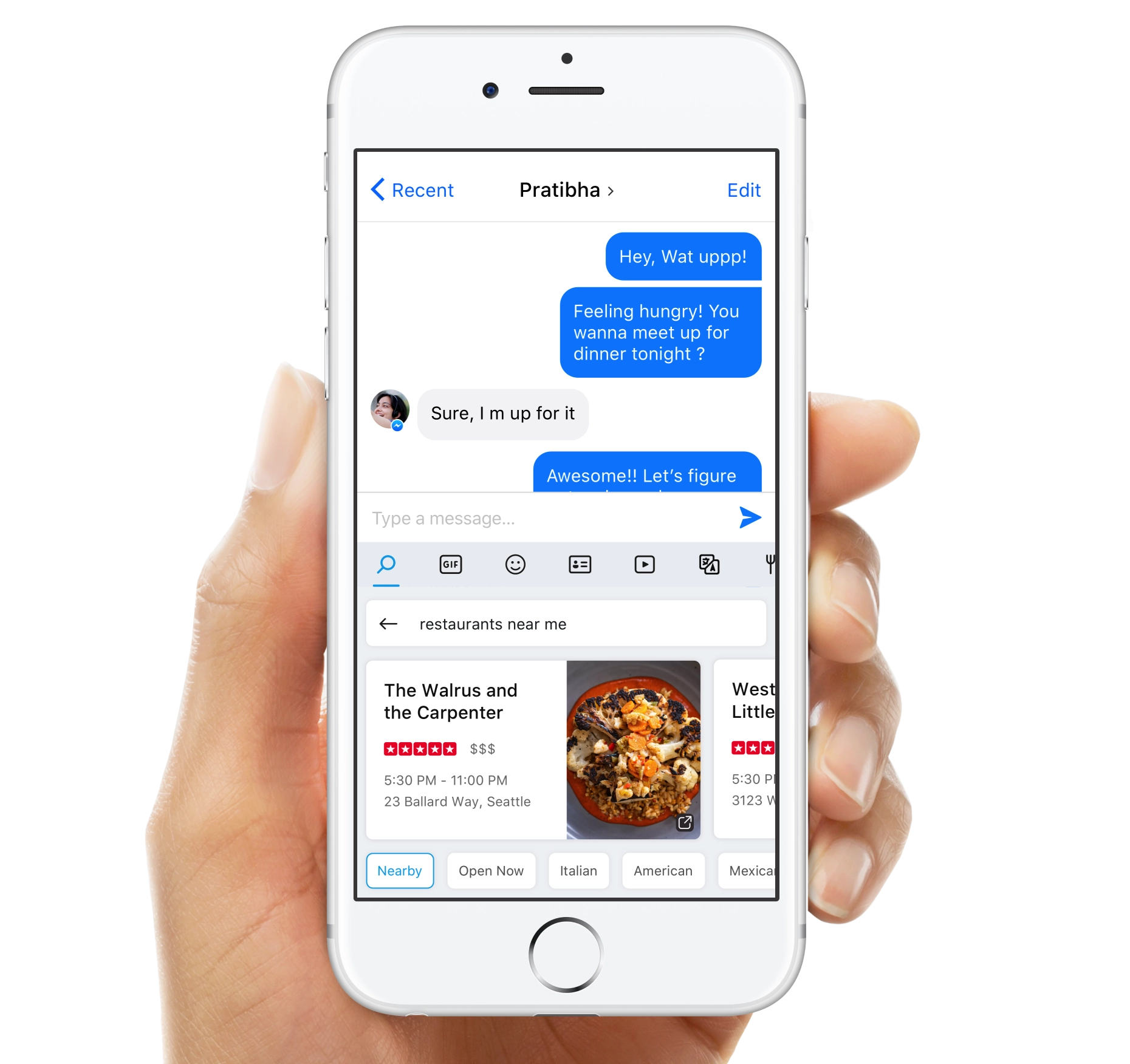
Wordflow Keyboard enables a blazing fast typing experience combined with in-built search to enable quick sharing and reduce context switching. The project started as a hackathon project where I was trying to solve the problem of excessive context switching to achieve small tasks. Users had to switch context from their communication environments to find information, come back and share it.
The solution — a keyboard with integrated search so it could be used across any communication app. I pitched the concept to Leadership and the project got funded and ultimately became Wordflow Keyboard. Being the creator of the project, I led the design and strategy of the product. Apart from designing the core experience, my role was to set the foundation and create a roadmap for a successful product.
ROLE
Founder and Product Design Lead, Microsoft ・ 2014 - 15
Vision & Strategy ・ Product Design・ Concept Design・ Executive pitches and reviews ・ Fostering relationships between partner teams
FEATURED IN

The Problem
It was tedious to share while having text conversations. To share a video the user had recently come across - one would have to switch from the chat app, go to a search engine or the youtube app, search for the video, go to the video and then share it. Similarly, sharing any entity information like a restaurant, sports scores, contact, etc was difficult.
This problem was something that I personally experienced, so after brainstorming sessions I came up with the idea of integrating search within the keyboard.
There was an initiative going in the team to figure out possible search integrations in other products and this aligned really well with that.
Evangelizing Early Explorations
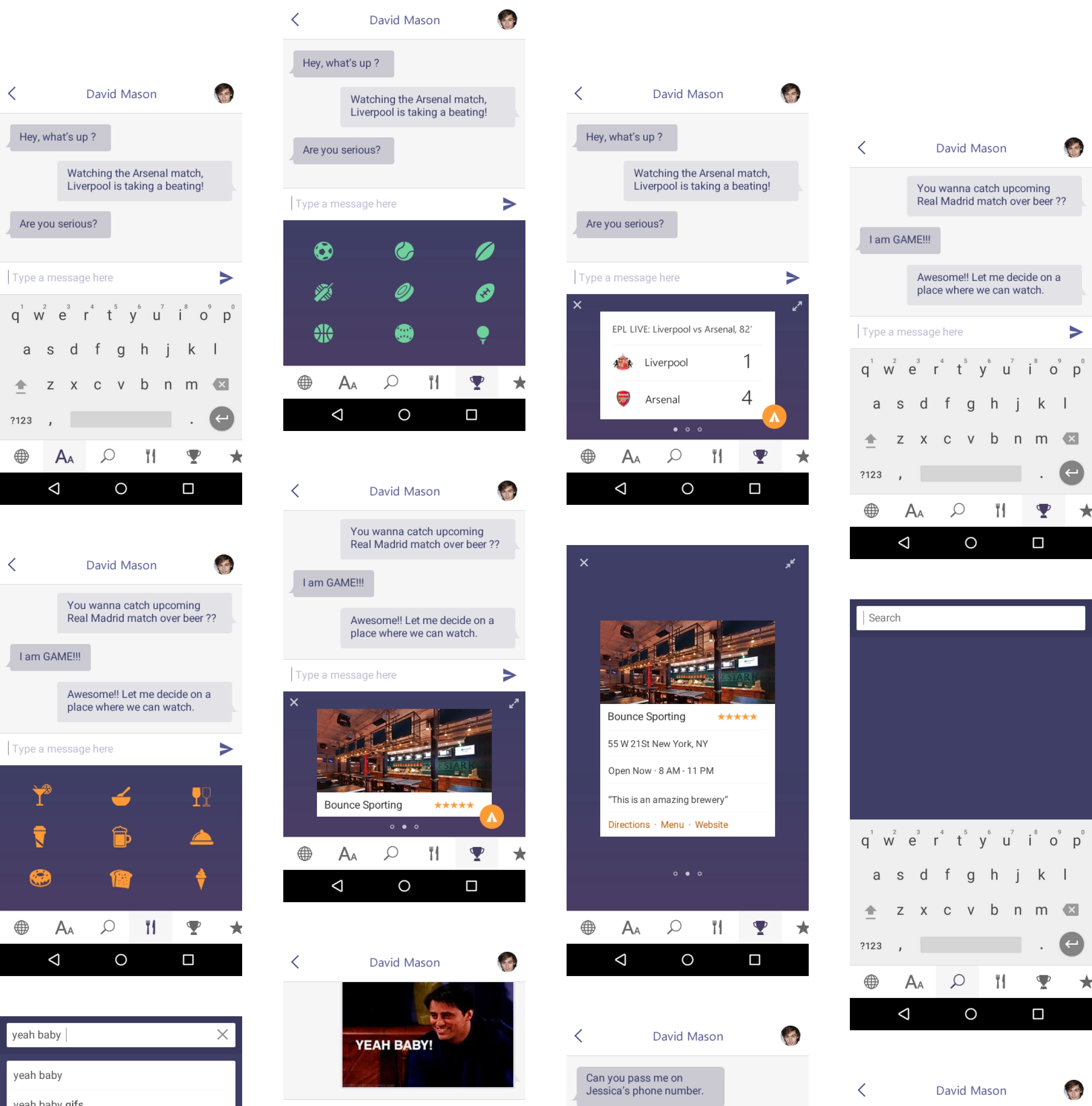
I explored multiple scenarios and designed the experience of search within a keyboaord. Luckily I was able to pitch the project to Leadership team and it got funded to be explored as a product offering from Microsoft.
Defining core value props
A team of devs, researchers and PM was formed to work on the project. We started to dig deeper into this area and concluded that a great keyboard for typing should be the basis of our experience and the search will act as a differentiator in the market. We set the foundational principles of the product to be Familiar, Fast, Delightful, Intelligent and Context-aware.
01 — Enable users to get information within the keyboard context to simplify sharing
02 — Enable users to type faster than the native keyboard and be more accurate
The Business Side
The project was compelling because not only it solved a major pain point for users, but also enabled us to deeply integrate our search experience while users used Messenger, Whatsapp or Skype. It opened a lot of avenues to bring all rich data from bing to the users.
Enable users to get information within the keyboard to simplify sharing
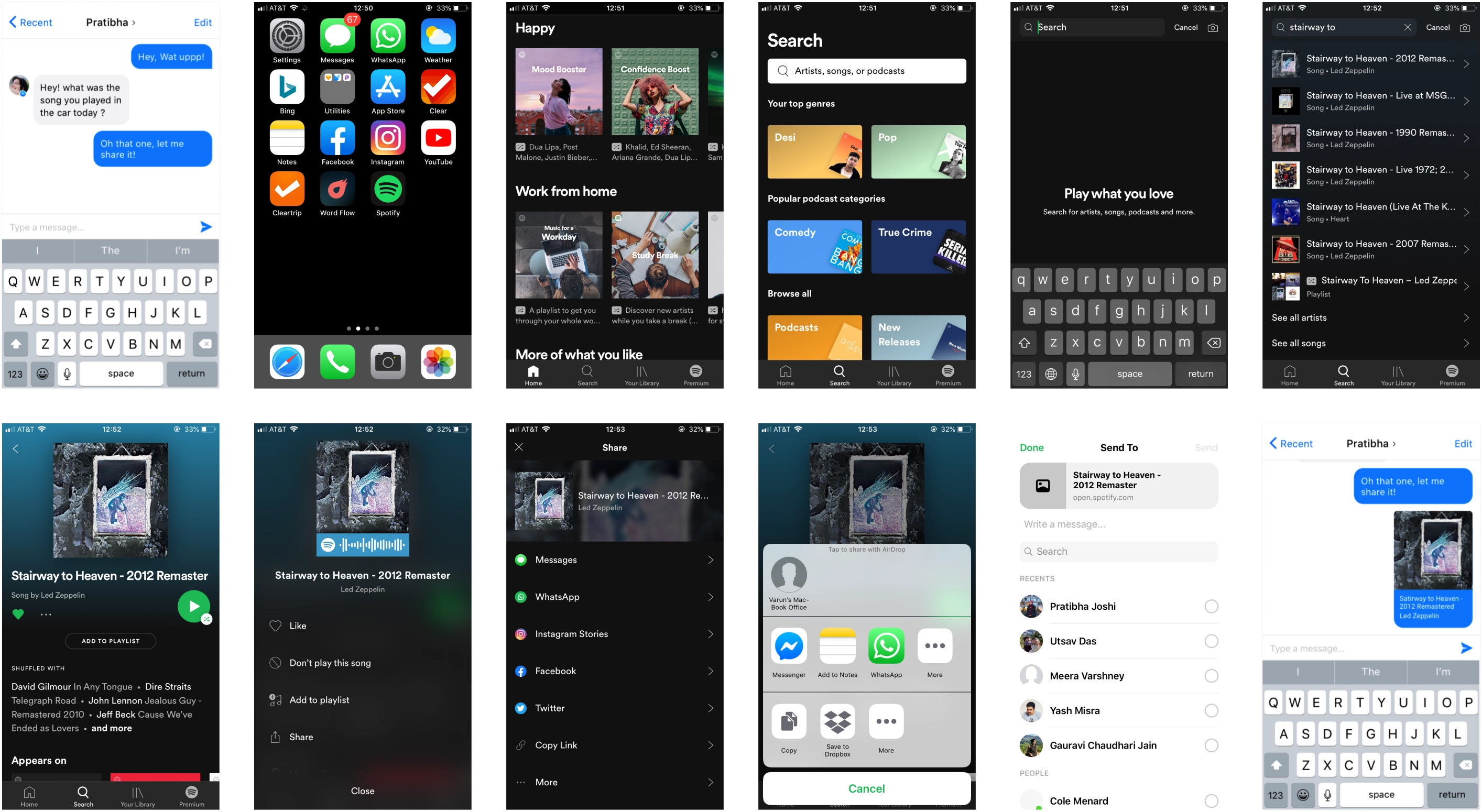
It took almost 12 steps to share information while chatting which disrupted the flow of the chat but also made it tedious to share. Below were the steps to share a song👇
Exploring Interaction Models to integrate search in the keyboard
Once the project was funded, I explored more interaction models for the keyboard. Our key principle was familiarity, we wanted the keyboard experience to feel familiar with the native iOS keyboard so that the learning curve / adjustments were as low as possible.

Bottom Bar
This was the first model that I came up with while I was designing the hack. It seemed to work well but this meant shifting the keyboard up which could lead to a frustrating experience while typing as it would require users to re-calibrate.
Top Bar
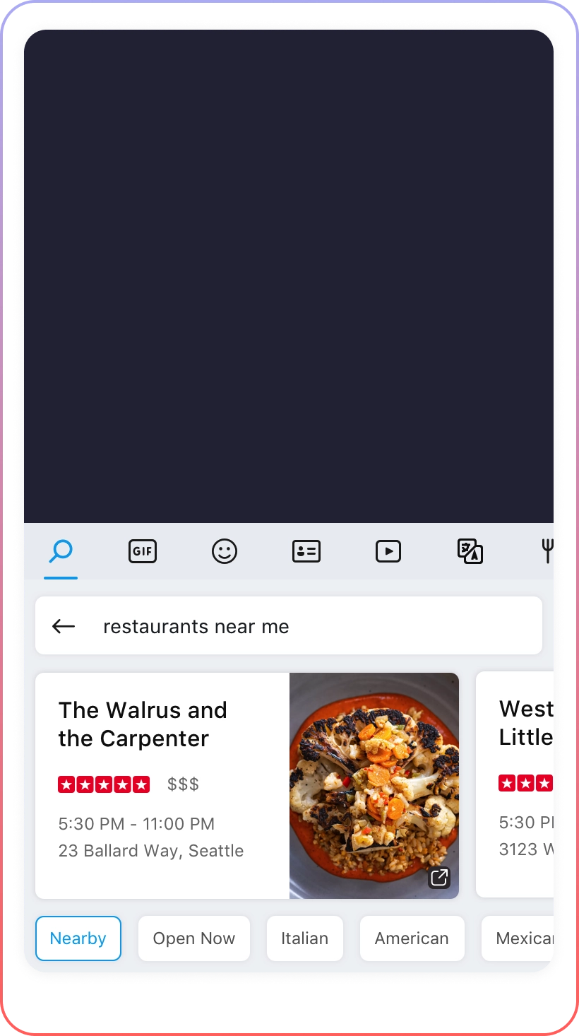
Keeping the keyboard experience familiar with what users were using, the top bar came out to be the best candidate out of all the models we explored.
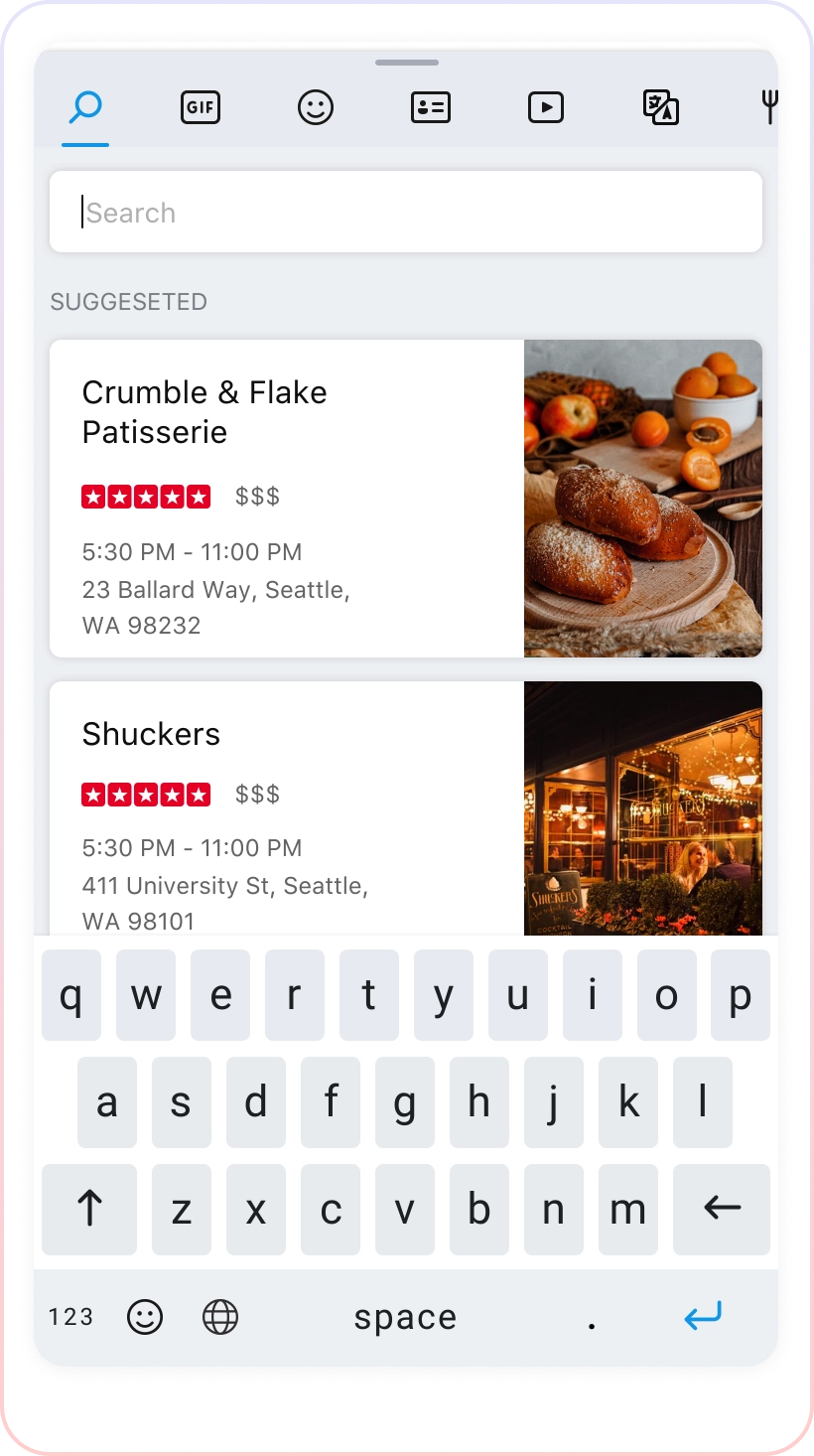
Fullscreen
This was an extension of the top bar model, though this could provide more area for the experience but users could also lose context while chatting.
FINAL SOLUTION
Search Experience within the keyboard to make sharing anything easy and fast
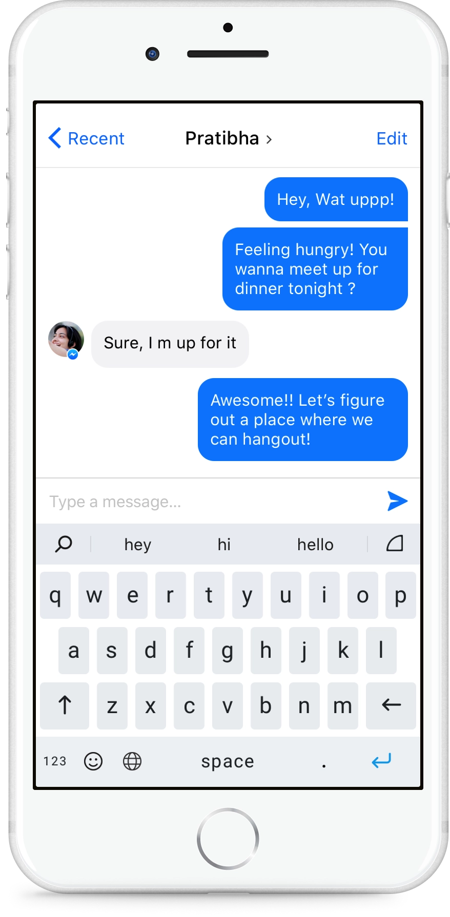
Default keyboard state with Search on left, Arc keyboard invoke at the right and word suggestions based on the typing history, context and conversation.
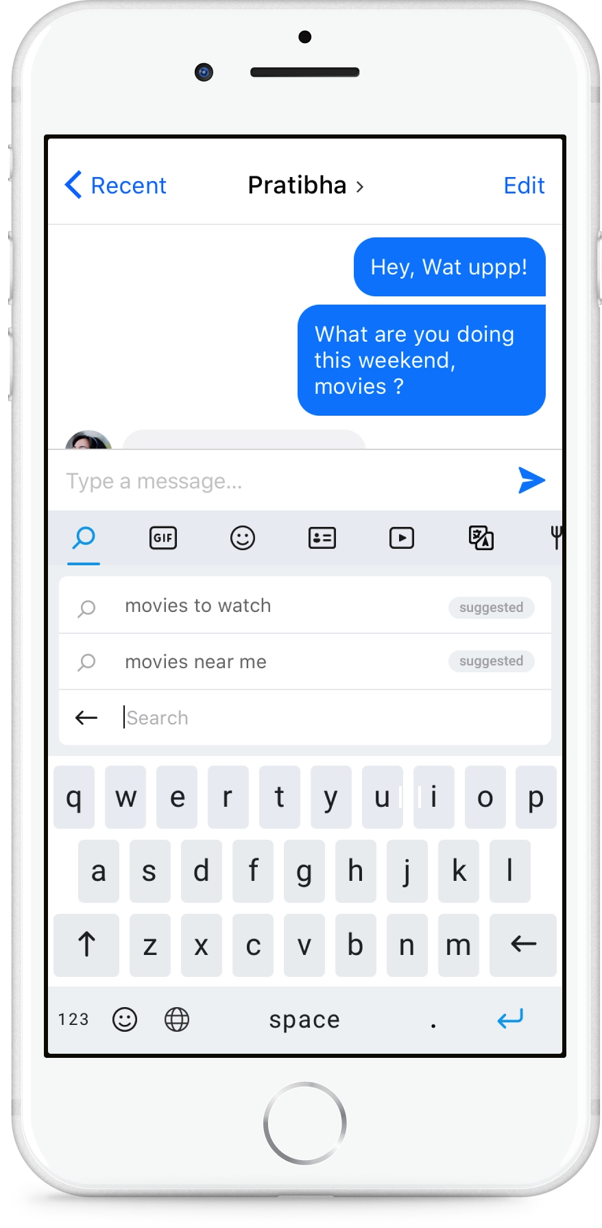
Zero Input screen brings suggested information based on the recent conversation input by the user. Here Jake is asking Pratibha to go to the movies.
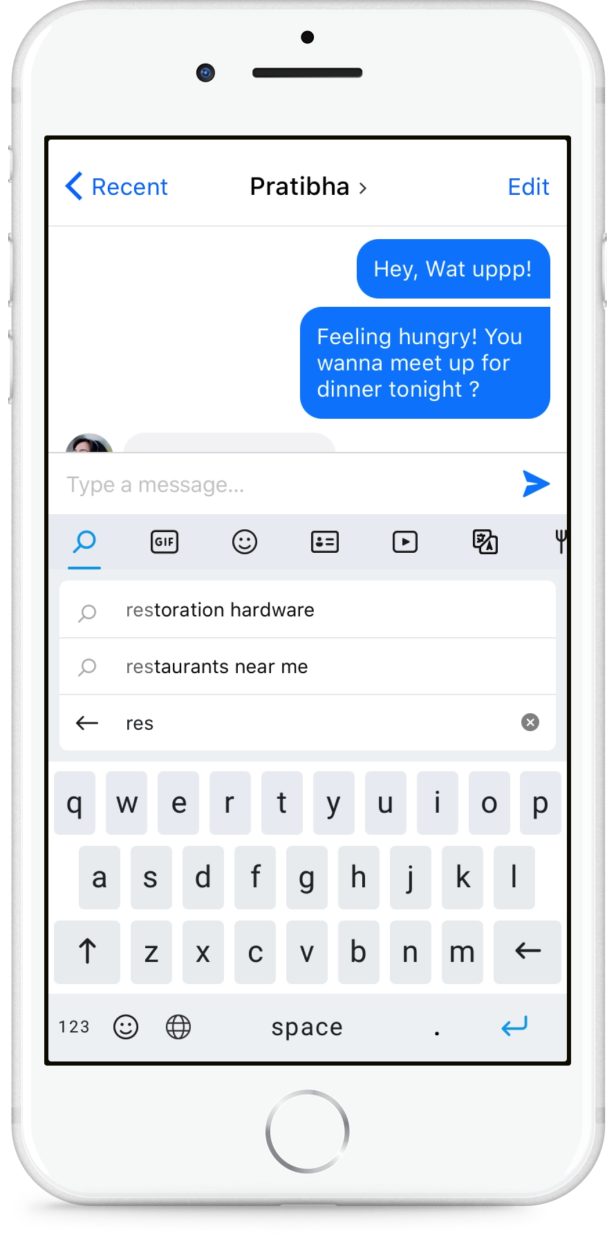
Auto suggestions based on the query to simplify searching. The user uses the back button to go to the default state.
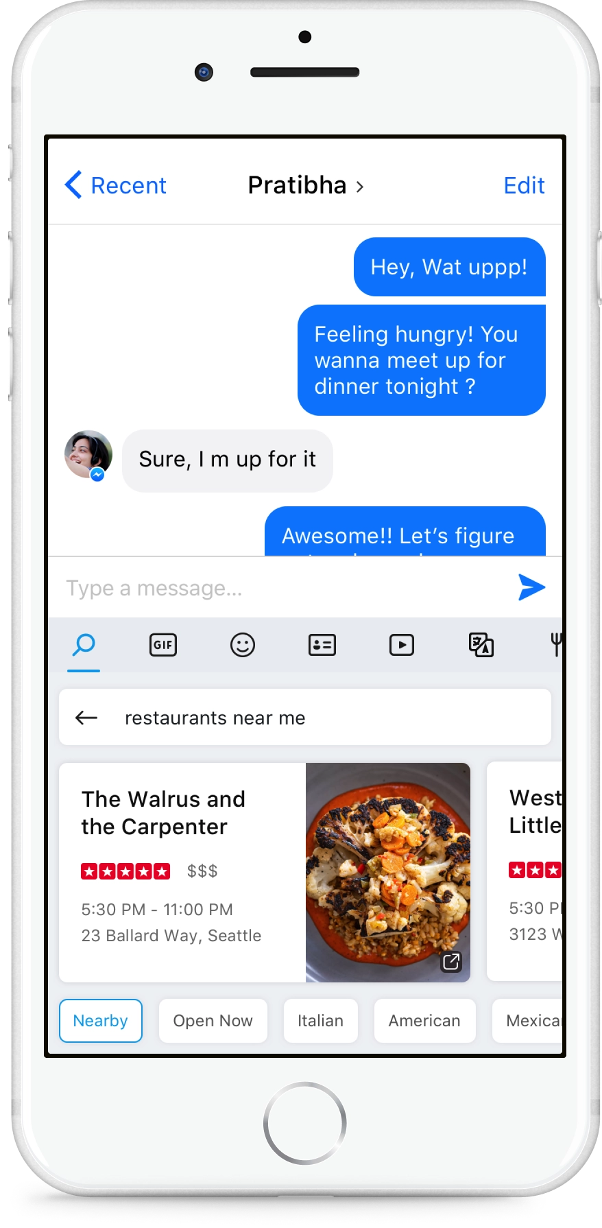
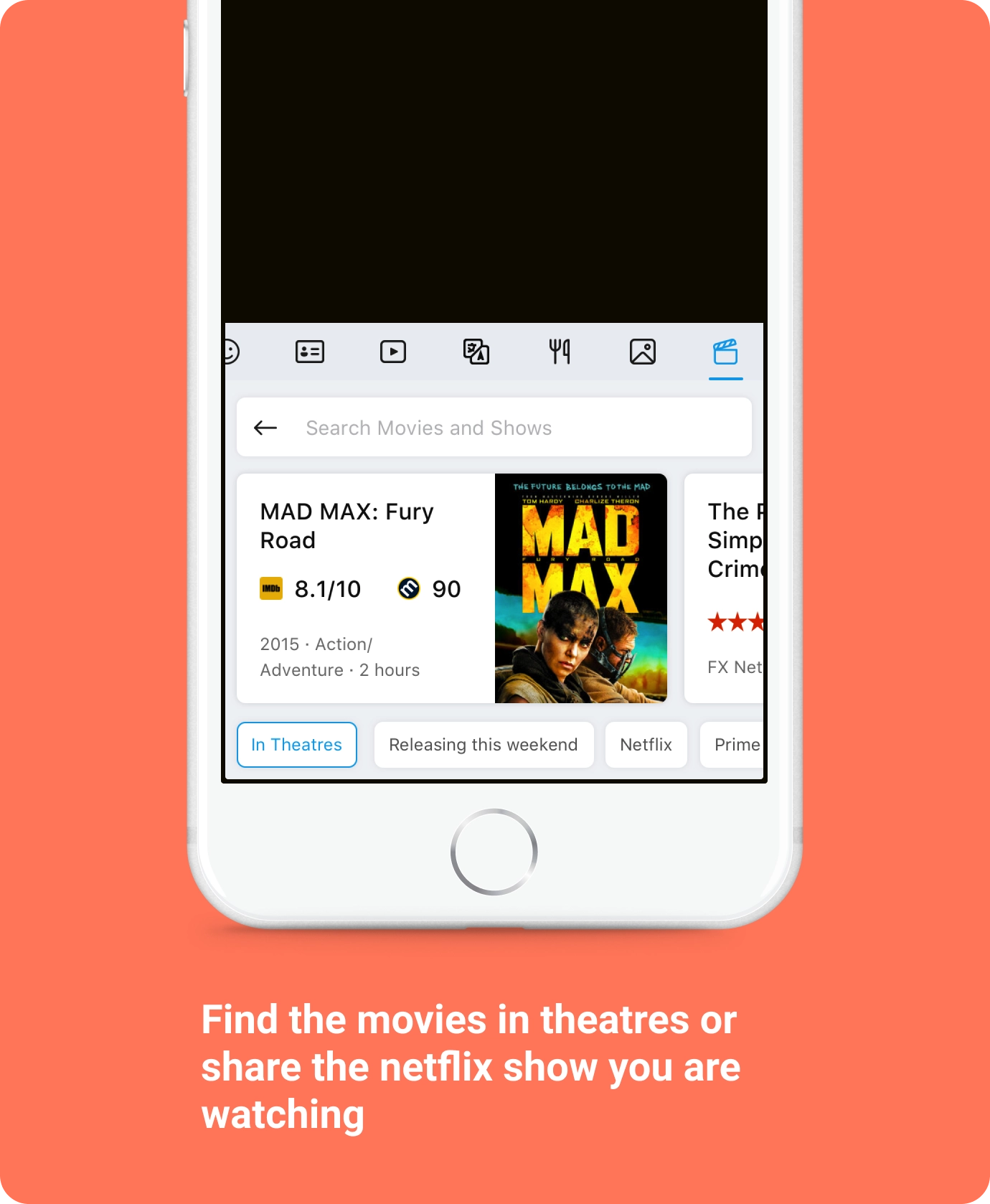
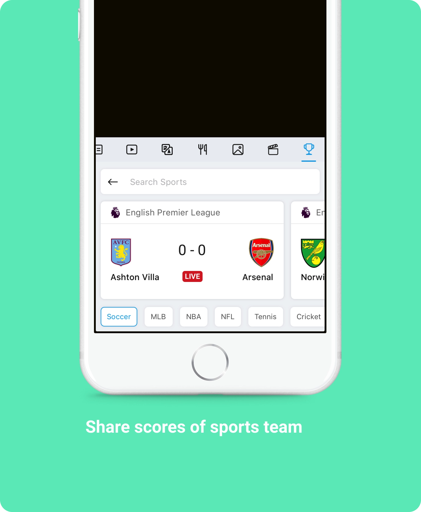
Answer results for entities are served in card format, and provides quick categories to minimize typing.
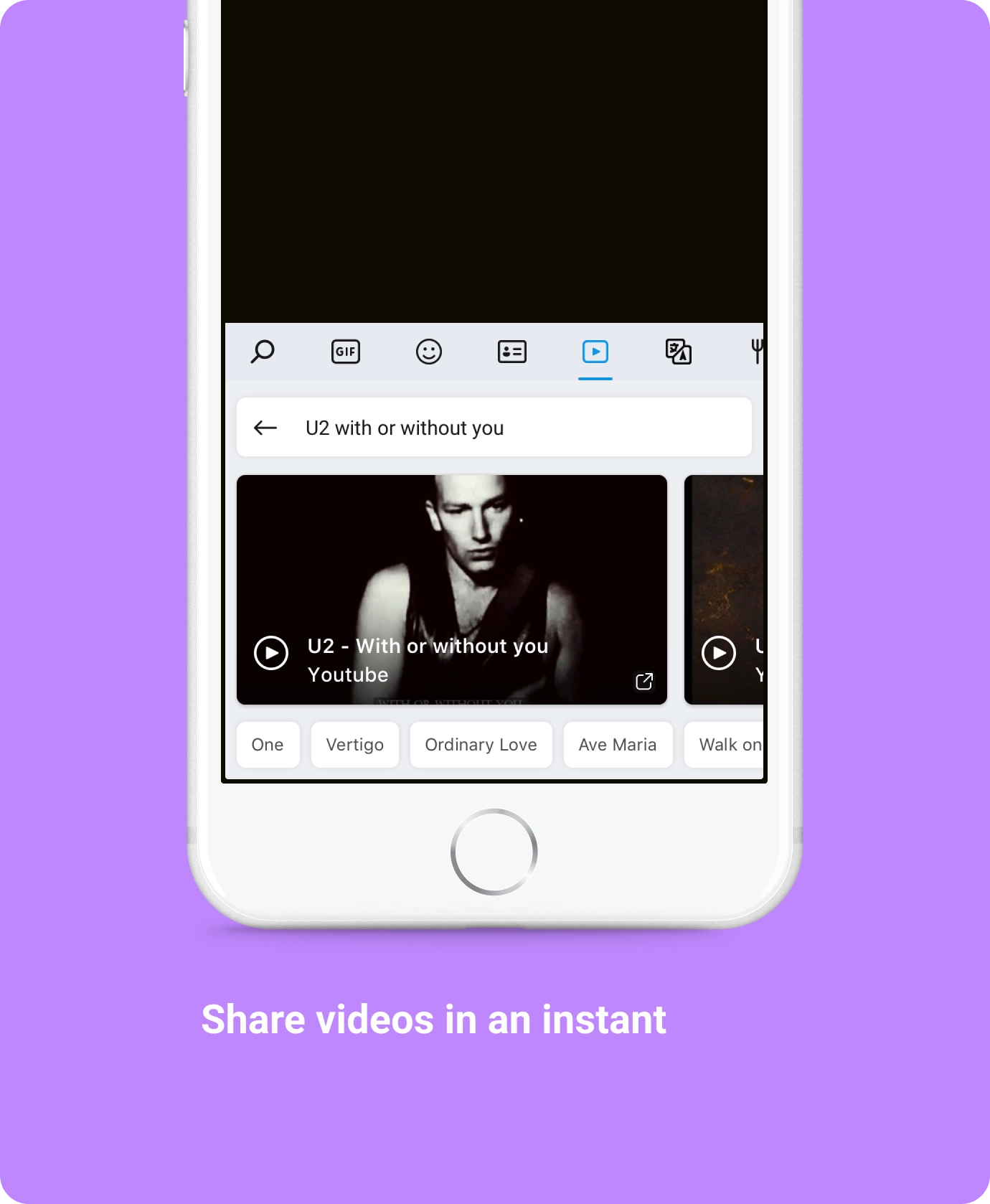
Search supercharged with structured content from the web
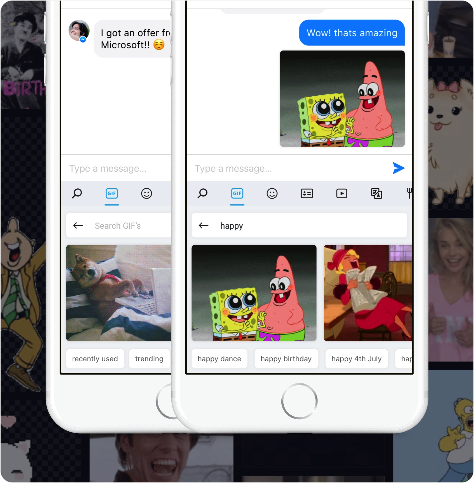
Search GIF’s and light up your conversations
Who doesn’t like to send GIF’s when we chat. Brining GIF’s from all over the web was a major feature and we focused on proactive scenarios as well which brought trending GIF’s, new GIF’s based on current news topics.
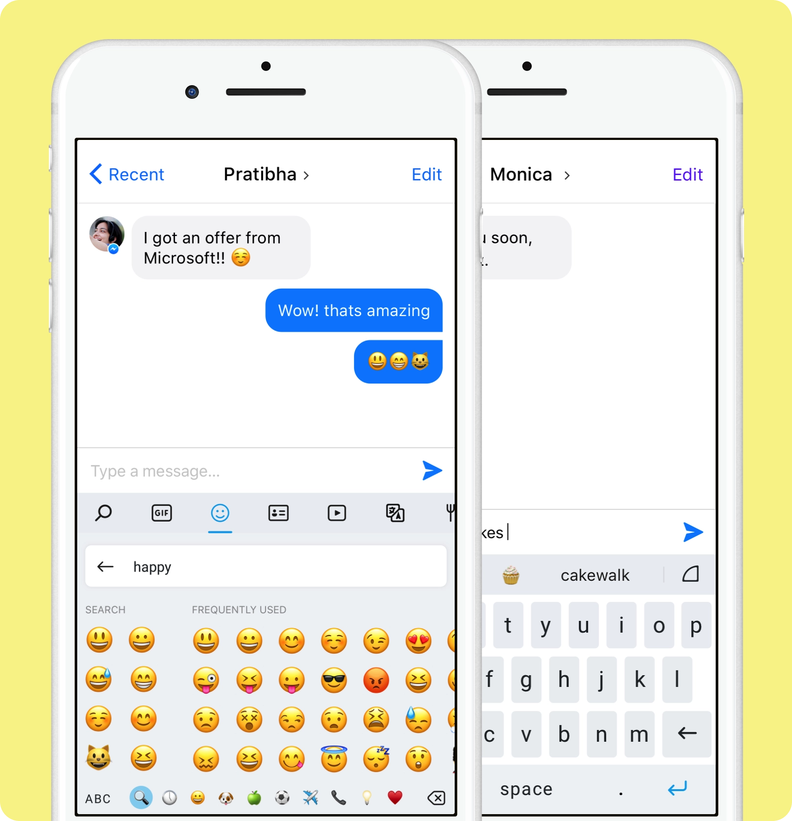
No more endless swiping to find that emoji
How many times have you swiped endlessly to find that one peculiar emoji for the situation and had no luck. iOS keyboard lacked the functionality to find emoji’s based on keywords. Now the users could simply enter words and find the right emoji in seconds. Also, we brought emoji suggestions while the user is typing based on the current word or next predicted word.

Easily communicate in any language you like
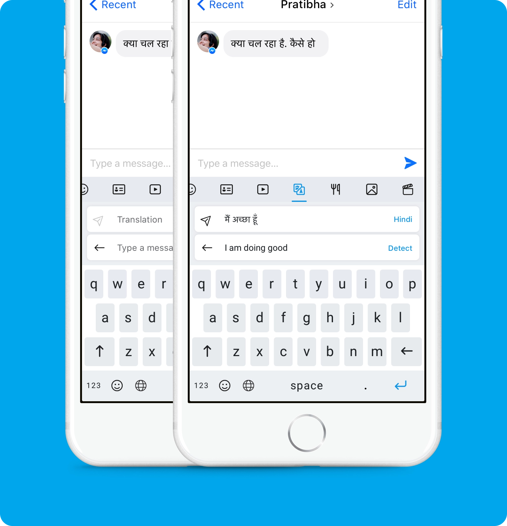
How can we break the language barriers and enable users to have a conversation in another language? The current process was broken and it was tedious to go to a translator, enter text and bring back the translation. This was a great opportunity to bring all the goodness from Microsoft Translator and integrate it into the app.
3rd Party Extensions, your fav apps in the keyboard
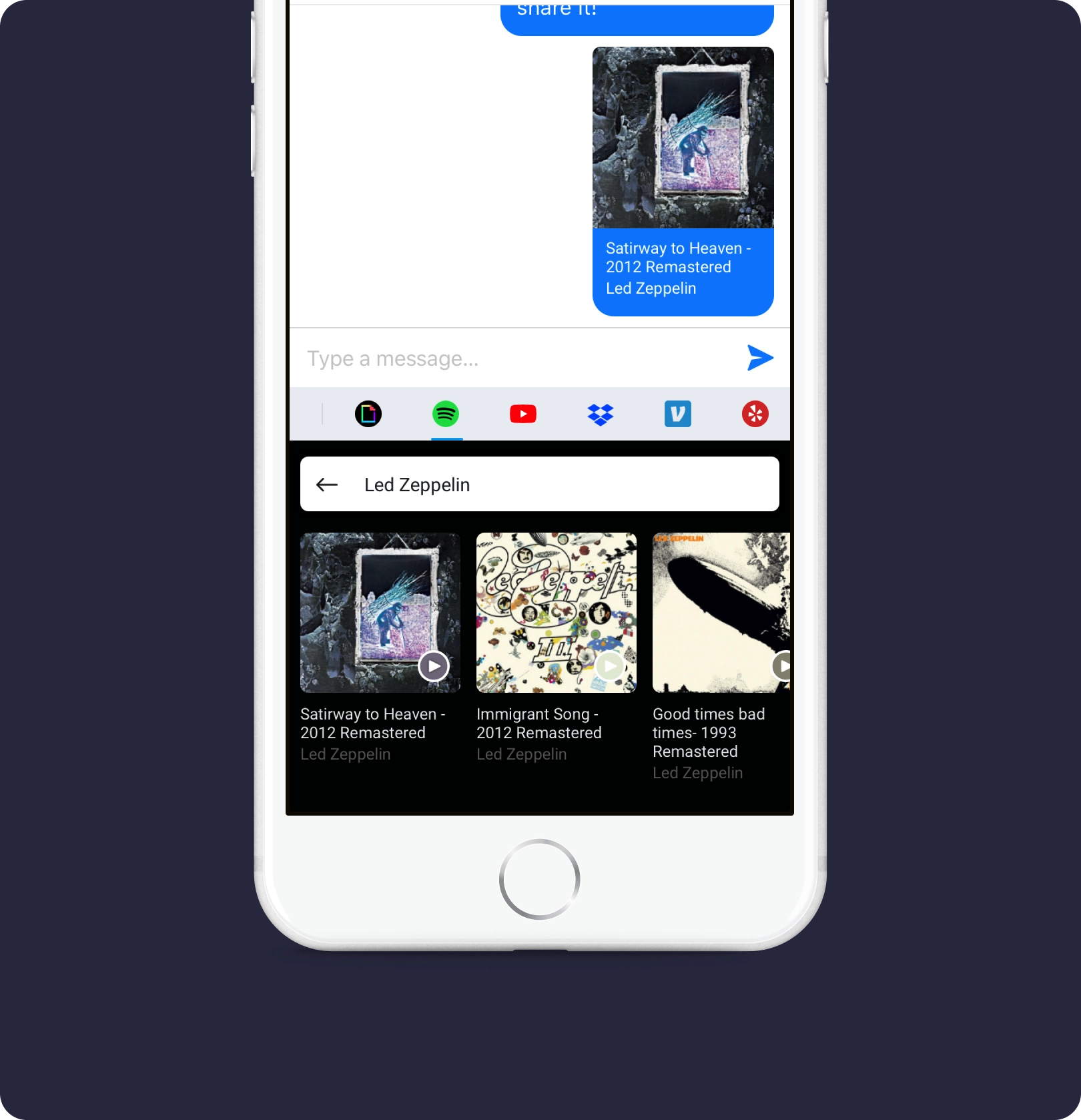
3rd party extensions allowed the users to get content from their favourite apps and easily share it from the keyboard. Ultimately this helped grow the product and bring more value to the users.
Card Framework
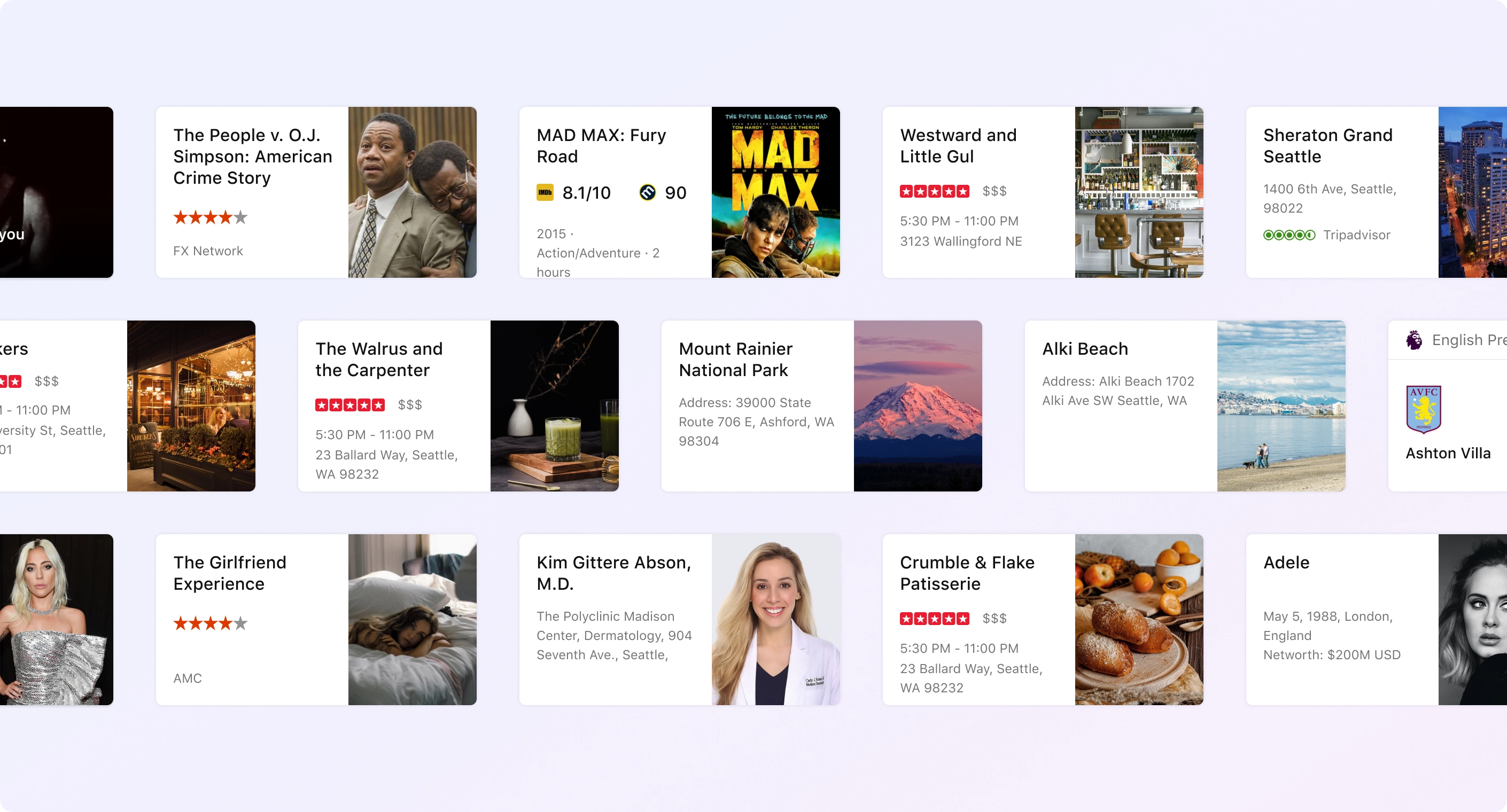
To enable the keyboard experience, it was imperative to bring all rich structured information Bing curated for the last several years in a short consumable format. I came up with the first card framework which spanned all answer and entity segments in Bing. These cards were later also used in multiple projects by the team, Bot experience, Bing on Tap and others.
Keyboard that learns as you type
Wordflow learns your writing style to suggest your next word. Enter a whole word with a single tap, instead of typing letter by letter.
The prediction happens based on the likelihood of it being typed. If you type “H-a-p-p-y,” “birthday” is much more likely than other common b-words or the next word. Similarly, it learns words that might not be in the dictionary like surnames and commonly used by a person during chat.

Solving the fat finger problem
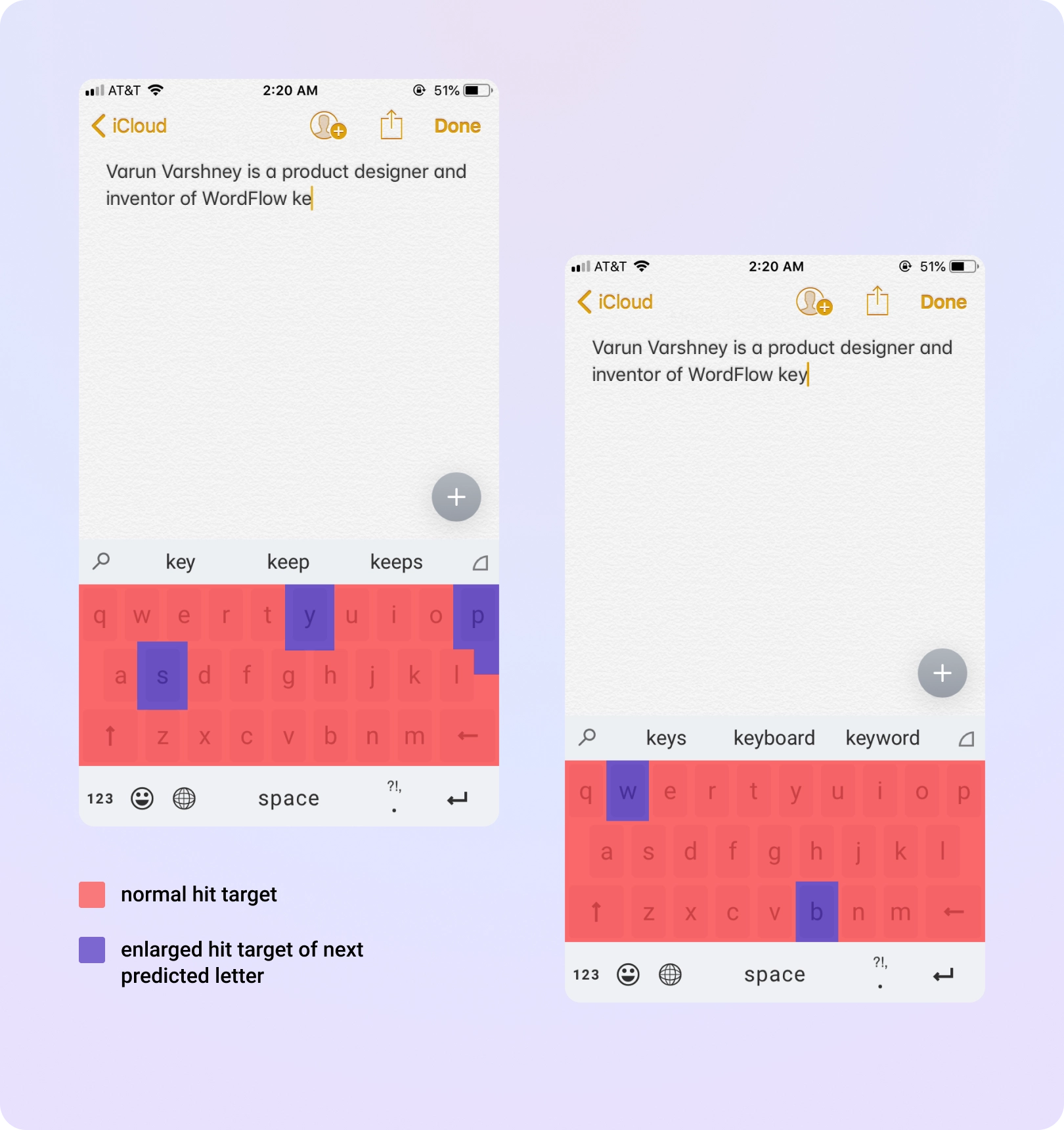
The keyboard predicts which key you're going to hit next and invisibly adjusts the hit target for all the keys to make the ones you're most likely to be trying to touch slightly larger — This technique was used on Windows Phone and brought to iOS.
One hand typing — the new normal
The trend for bigger phone sizes was on the rise, though the bigger screens did give a better user experience overall — but it created reachability problems. Using the phone or typing with one hand was becoming difficult. To enable people to type with one hand I designed different layouts which mimics the natural hand curve. This is easier and comfortable to use with one hand.
Swipe to type
Shape writing was a critical feature that worked well with the one-handed keyboard. Users could really increase their typing speed with this method. Also, we introduced a lot of small nuances like — flick up to capitalize the letter, tap and hold to move the cursor.
Make keyboard your own — Customize with themes
Themes gave users control over their typing experience. We created multiple themes - from being very minimal design to being rich and immersive.
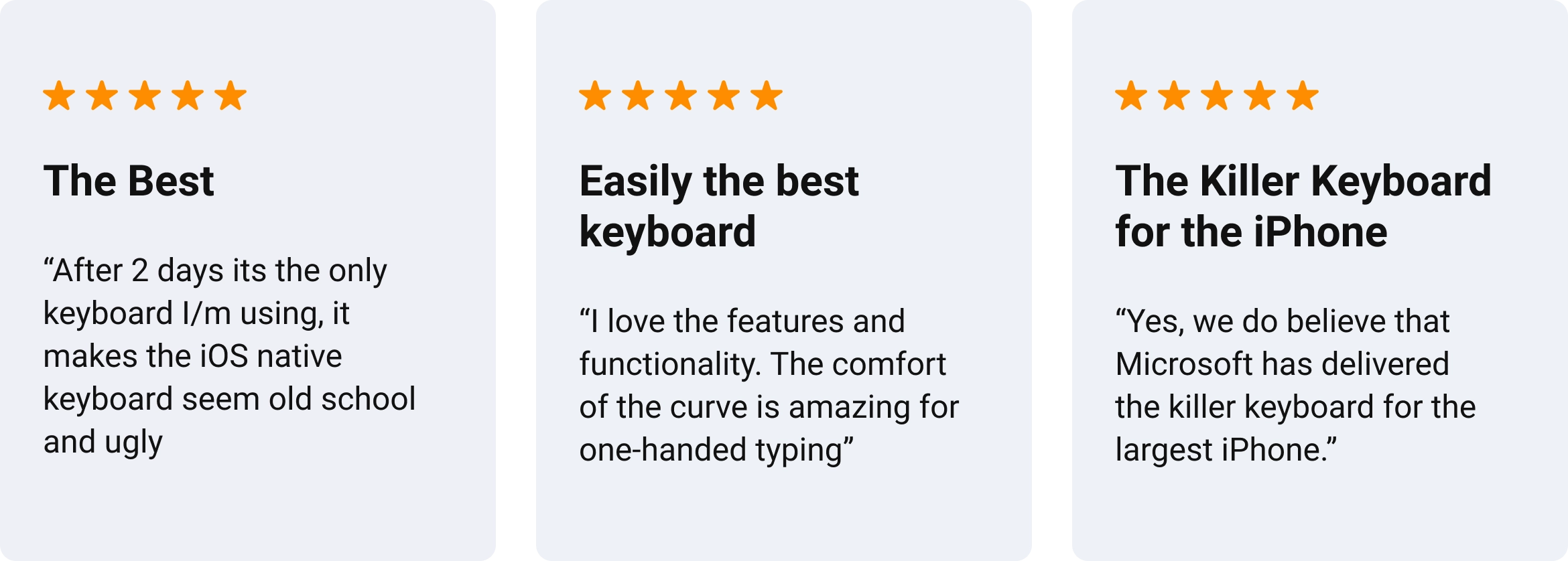
Appstore reviews
Impact & Learnings

This was a highly successful app that was the first to bring search within a keyboard as well as other numerous innovations for typing to the market. Throughout this project I learned a lot and it was a great journey with coming up with the idea, pitching and successfully launching the product 🙌