HUMMINGBIRD APP
An intelligent feed with personalized and snackable content to discover the web.
OVERVIEW
Bing over the years has built up a great search experience for it’s users. But it was falling short of engaging the users when they were not looking for something specific. The idea of a feed was floating around in the company to create an experience for browsing rather than just searching. The challenge was how you make an experience which is relevant, effortless engaging and habit forming. I led the creative vision for this product feature - from setting out goals, defining the framework, prototyping interactions and ultimately shipping the product.
ROLE
Product Design Lead, Microsoft ・ 2018
Product Design ・ Vision & Strategy・ Sprint facilitation・ Executive reviews ・ Fostering relationships between partner teams
Understanding the Feed Landscape
Before jumping into the design phase it was critical to understand the landscape, apps doing well in this space and the different feed products inside of market. We studied competitive news apps to better understand position our future product.
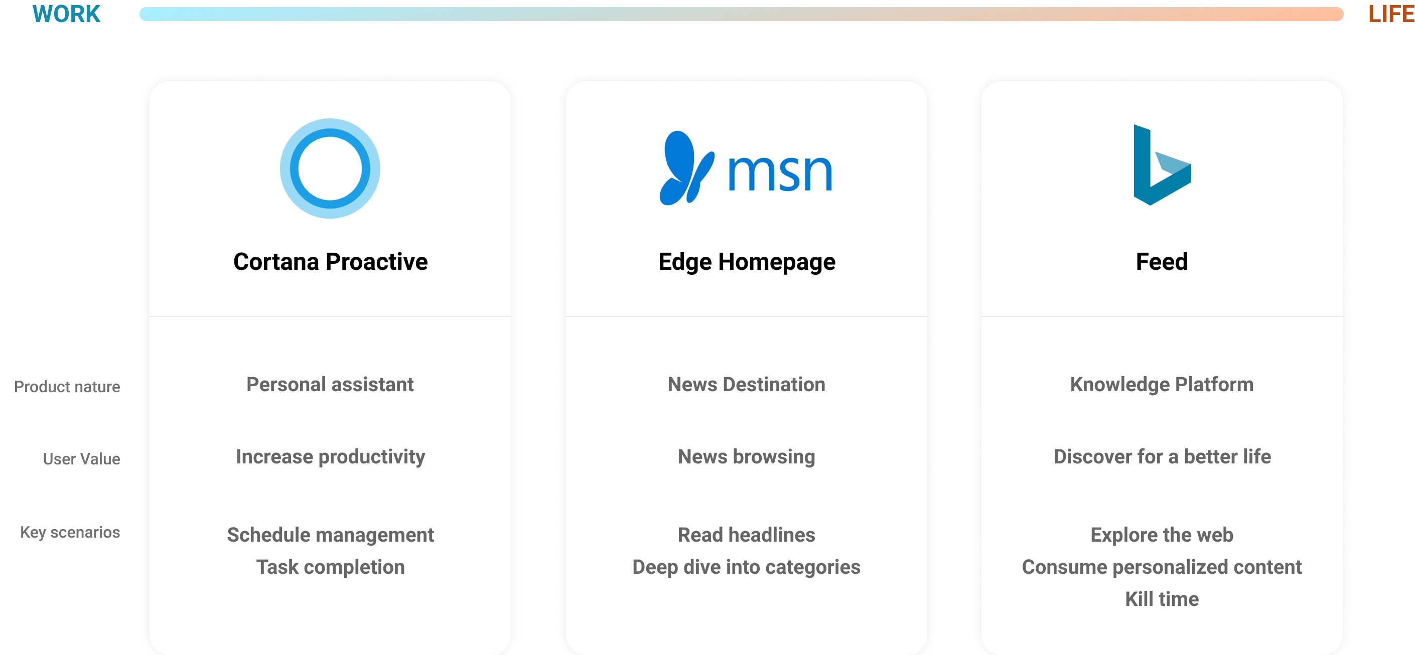
Core Themes and Objectives
We identified bigger themes that would help ground the concepts and ideation in user’s and businesses best interest. It also helped us scope the problem areas to go after.
01 — Enables users to discover news stories and content of their interest
02 — A Habit forming experience - optimized for quick consumption with snackable content
03 — Provide an unbiased, clear picture of NEWS
04 — Integrate the feed in other parts of Microsoft products and increase DAU and engagment
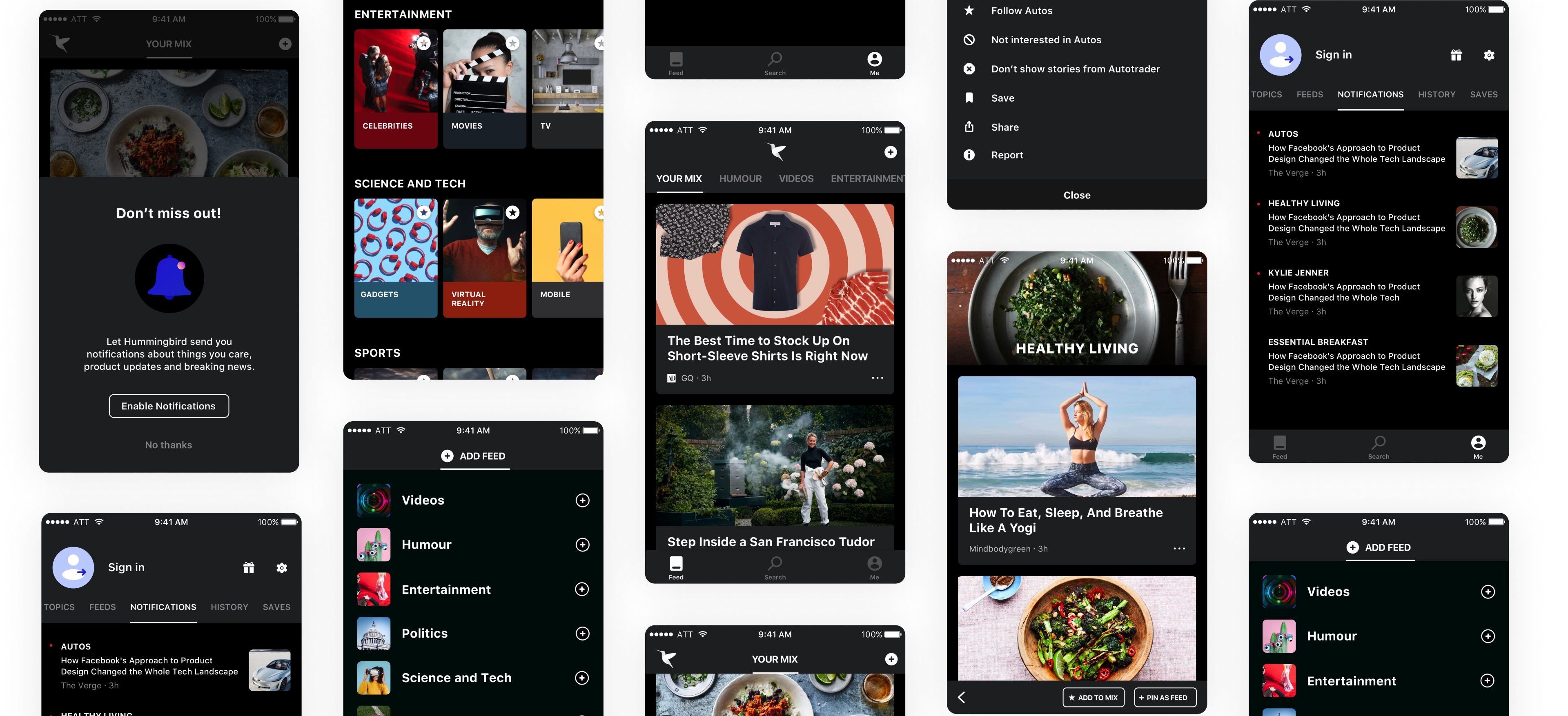
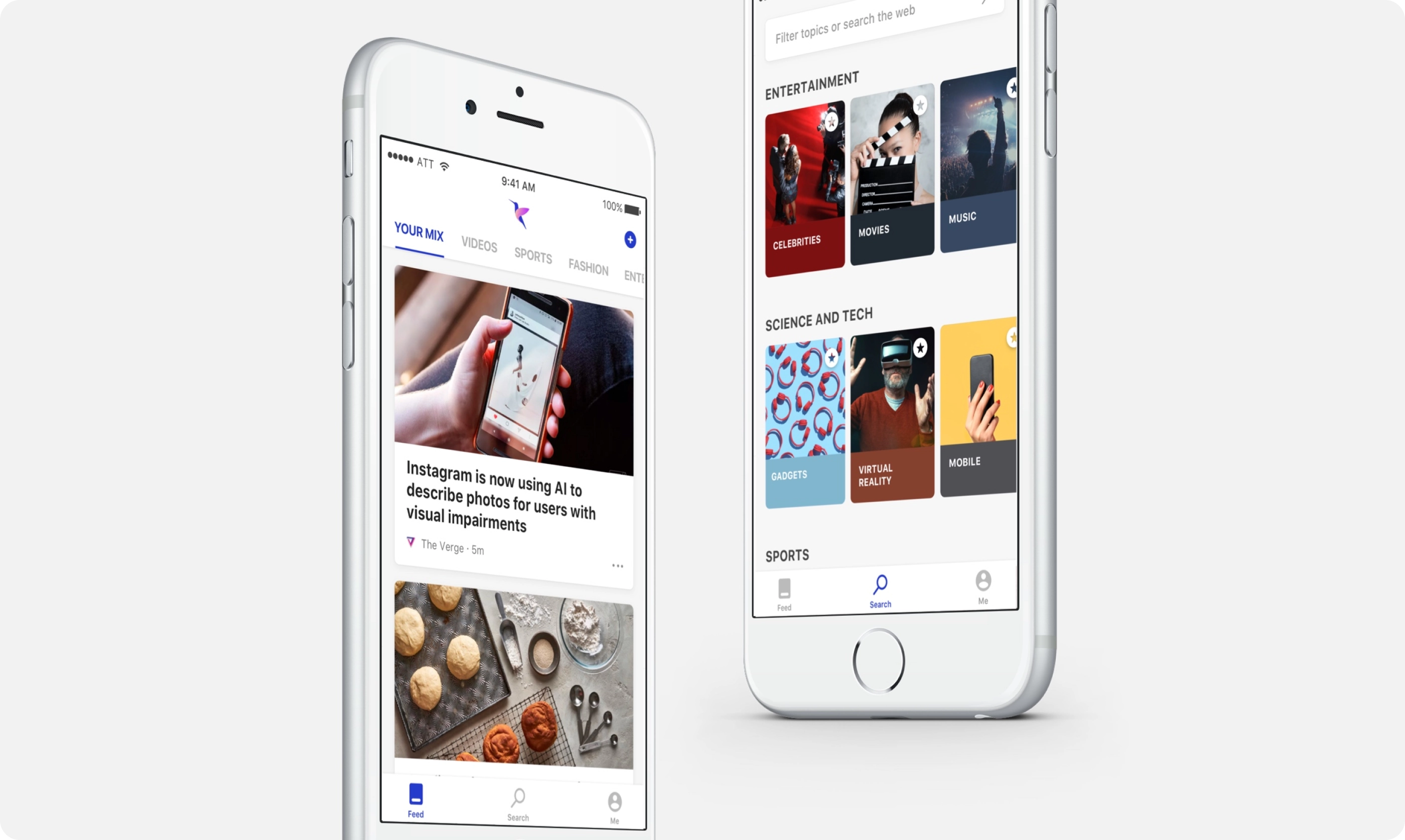
Discover stories from the web just for you
Hummingbird uses the latest AI and search technology to help you locate stories and videos on topics you care about and from sources you trust on the web. You set it up with just a few taps.
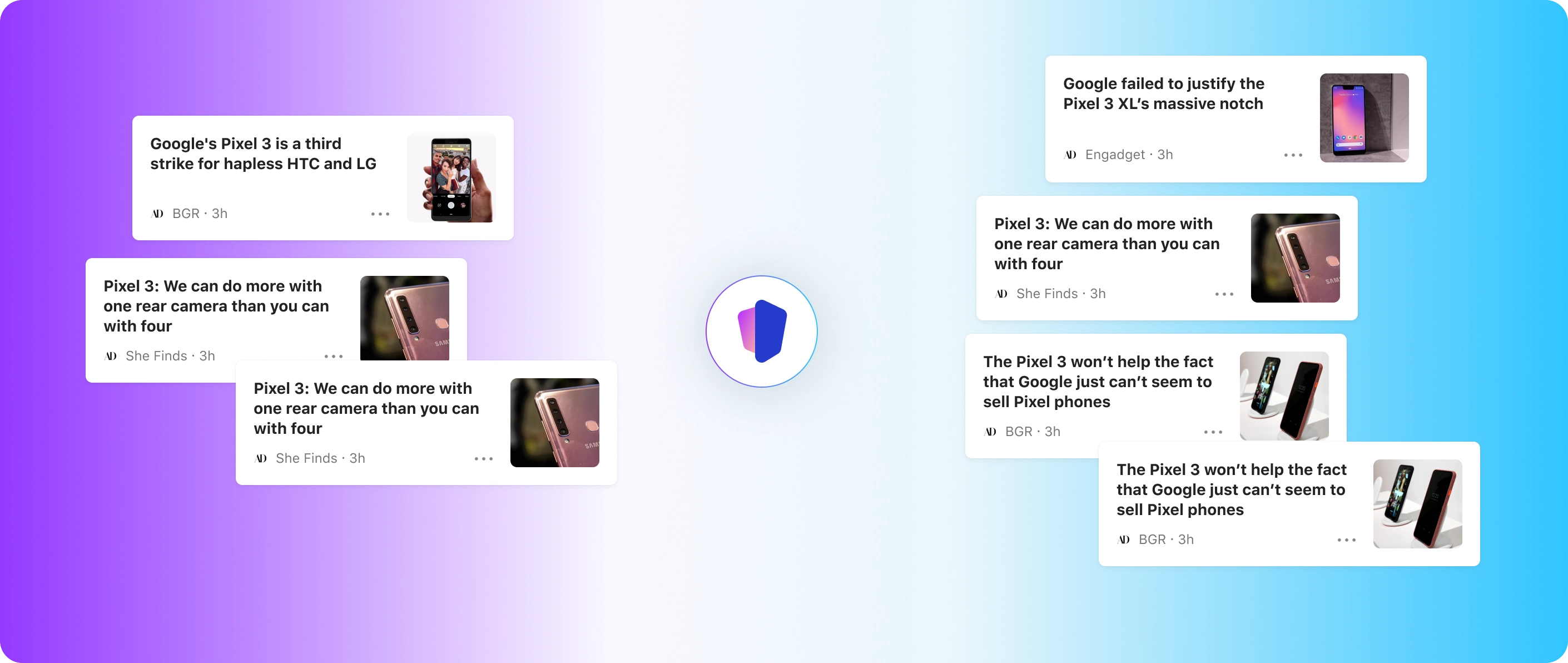
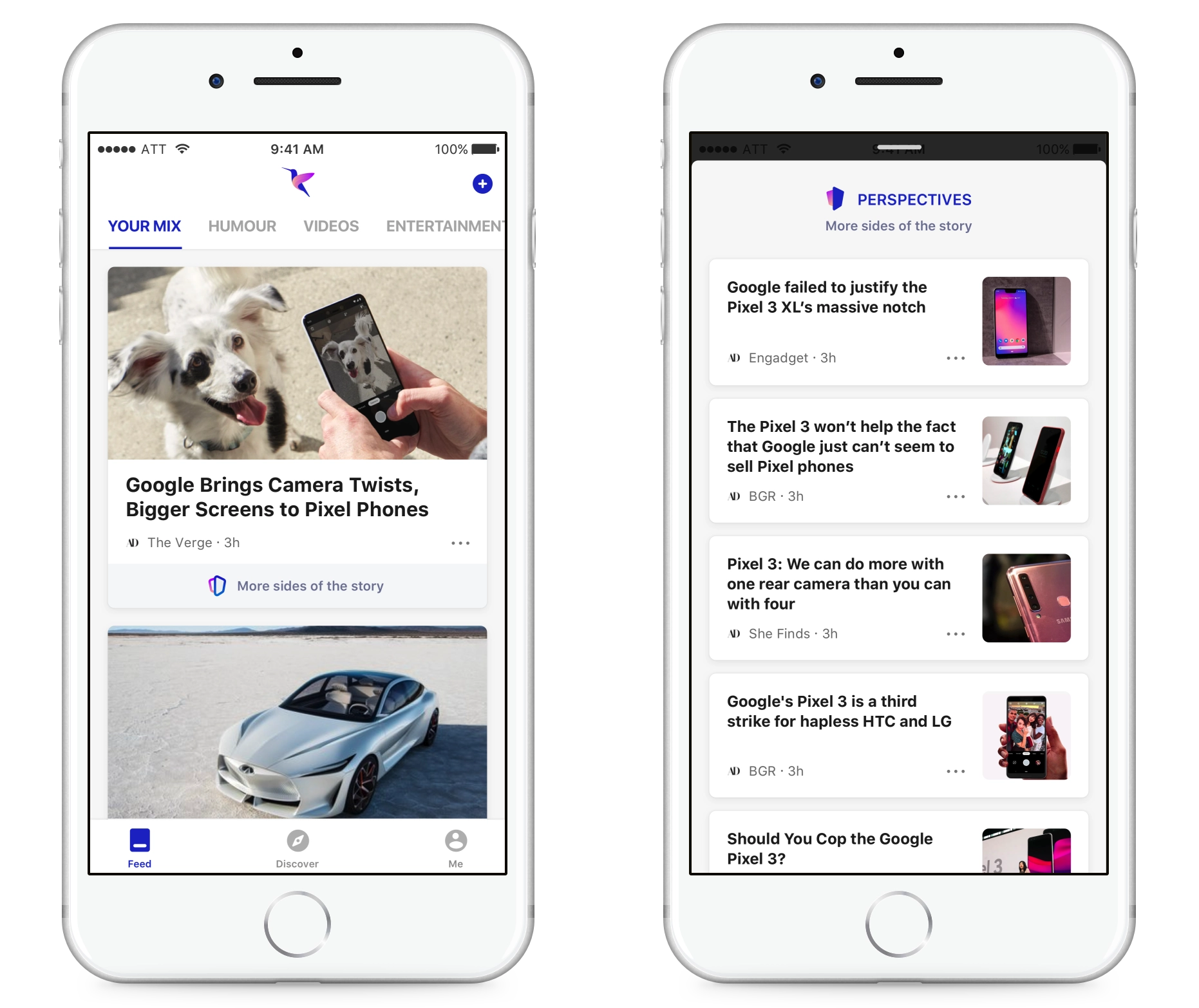
Rethinking News — Painting a comprehensive picture with alternate perspectives.
With the rise in misinformation, personal bias and agendas while reporting news stories it has become cruicial to provide a alternate perspectives so that user can decide on their own.
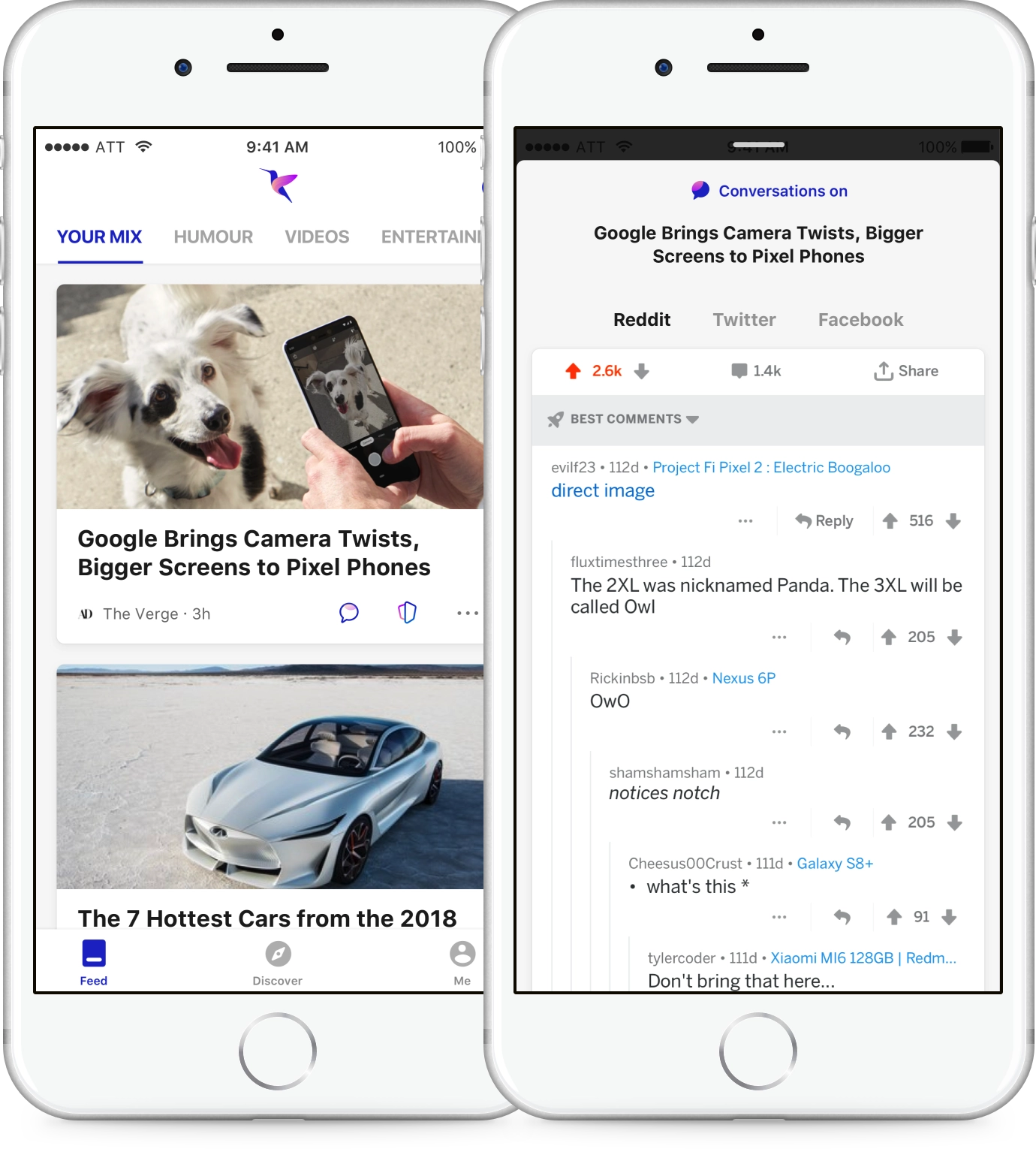
Bringing Conversations from the web
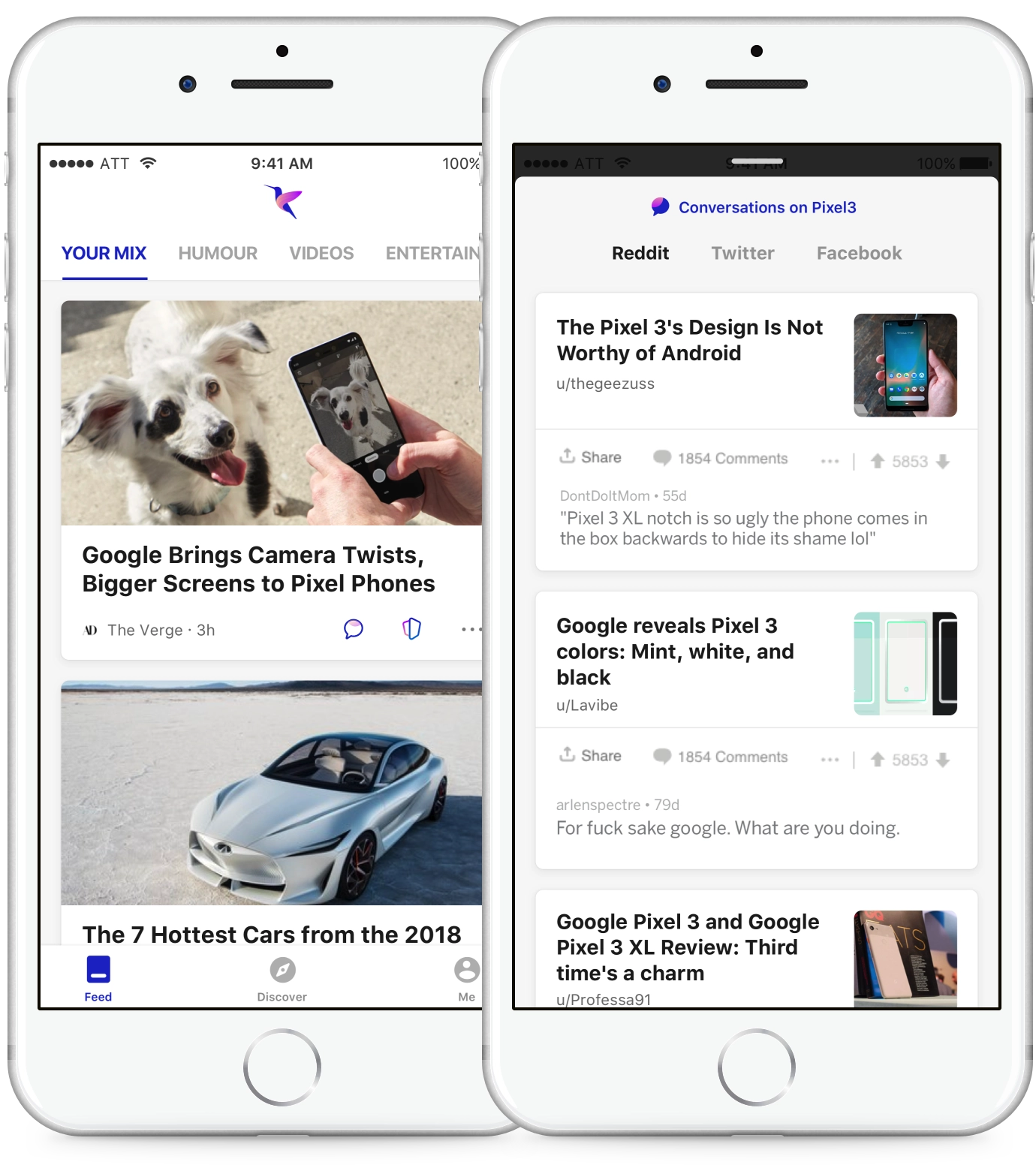
Comments and opinions from others form an essential part of reading news. The idea was can we bring and integrate all the chatter that is happening around a particular news story/topic from major social platforms like - Reddit, Twitter, Facebook.
Conversations based on topic
If conversations around that particular news story or article is not found then the AI extracts the topic from news story and bring articles from Reddit, Twitter from similar sites.
Listen to News on the go
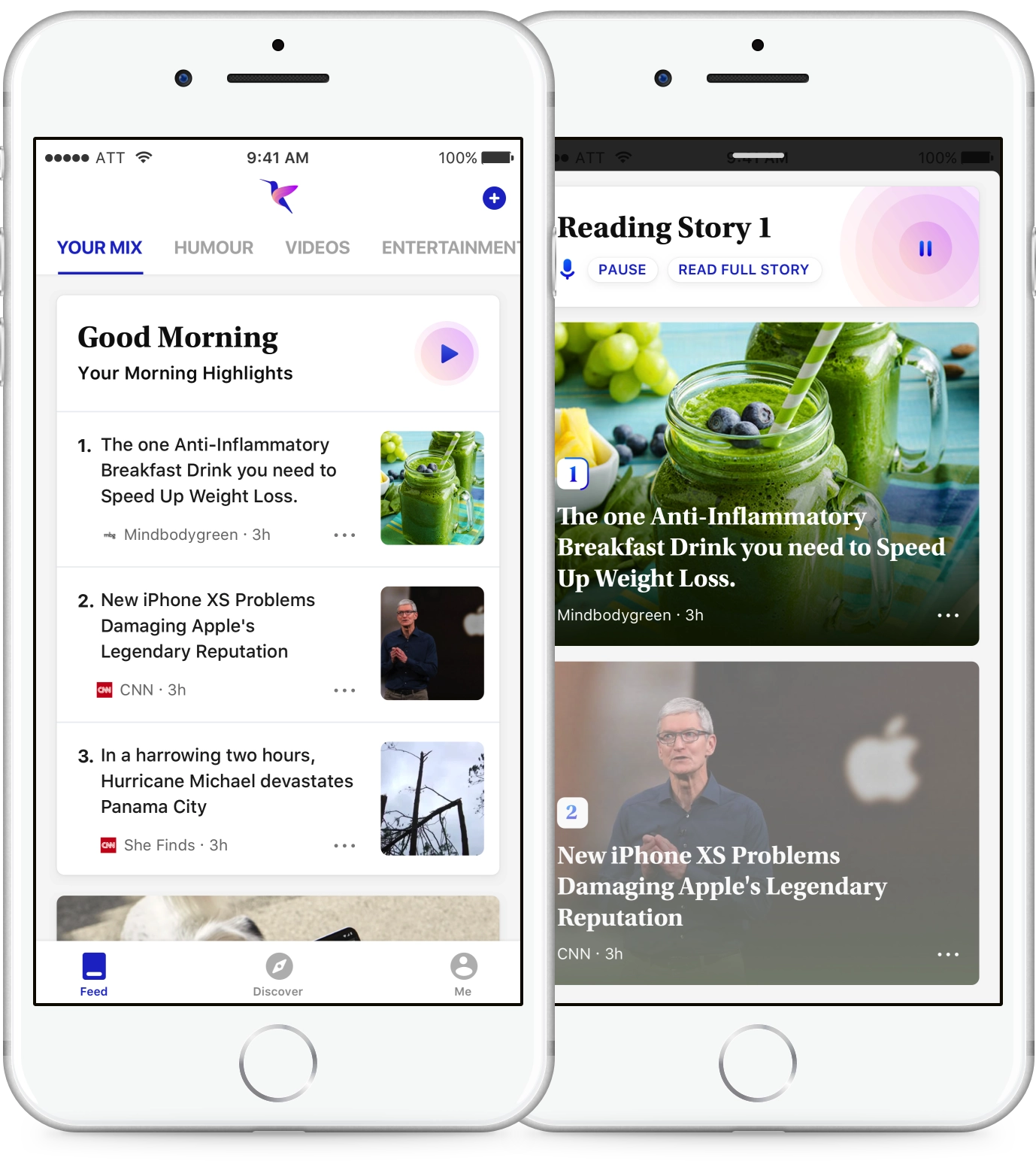
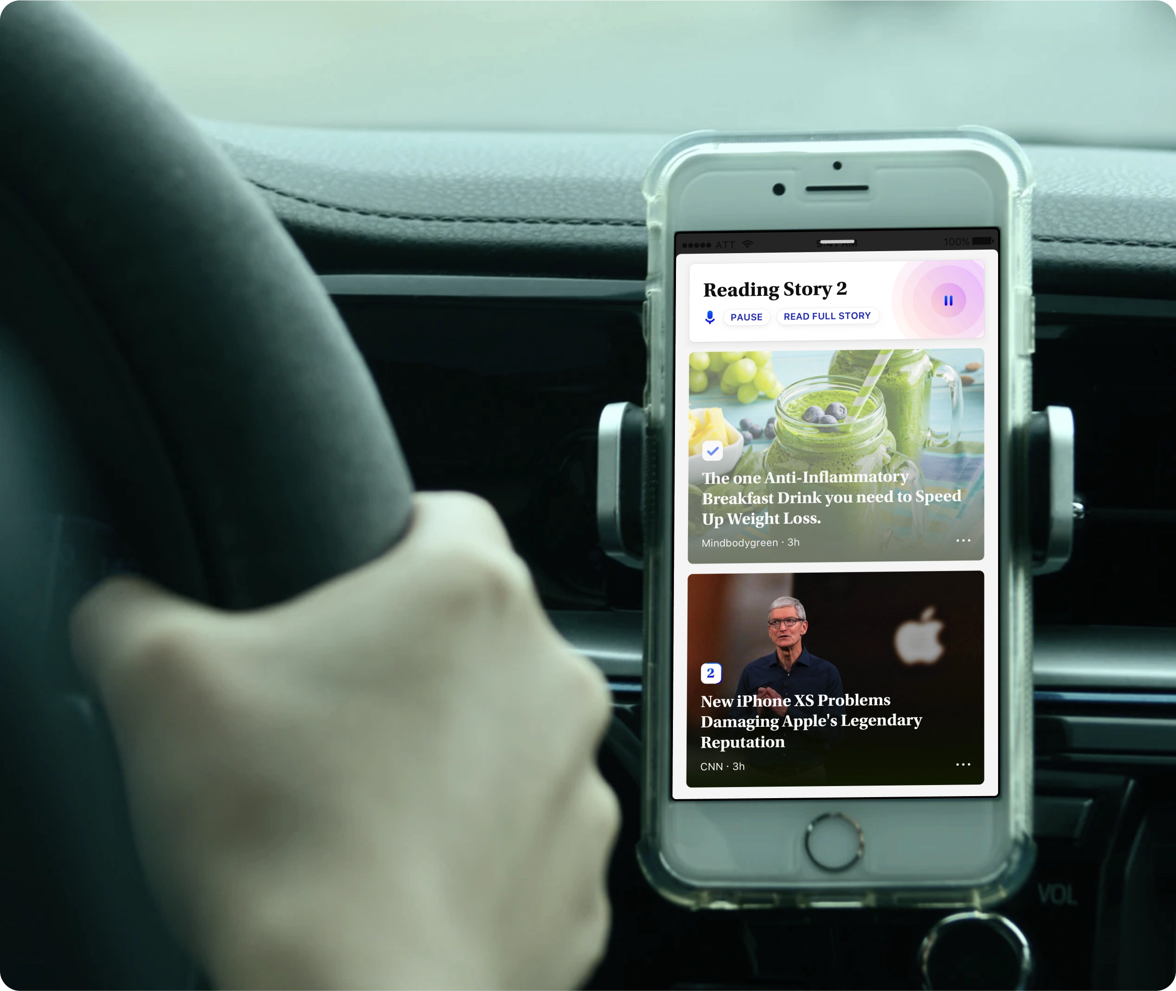
Bringing the top highlights for the user at the given moment with voice output for scenarios when reading is not ideal like morning and evening commute.
Your mix, your way
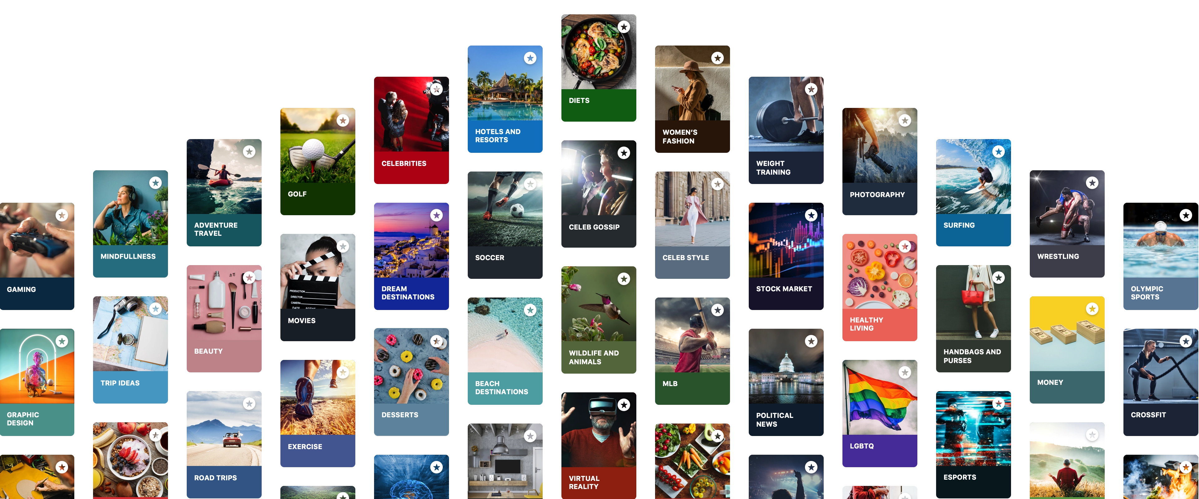
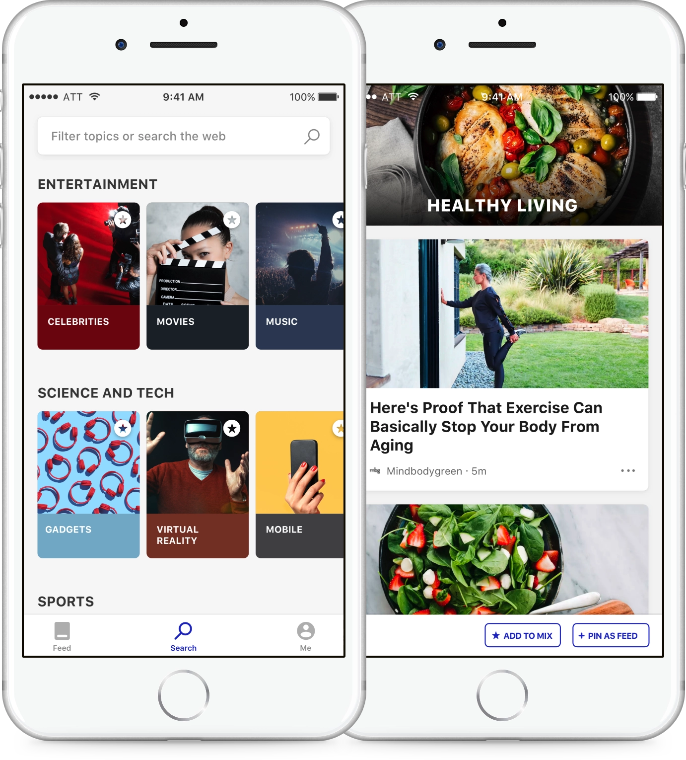
Select from a wide variety of topics to search for—movies, celeb gossip, fashion, nutrition, soccer—to build your mix.
Dig into the topics you love
We curated many topics across all top categories, which made it easy for users to follow what they cared about and get relevant stories.
Pin feeds that matter to you
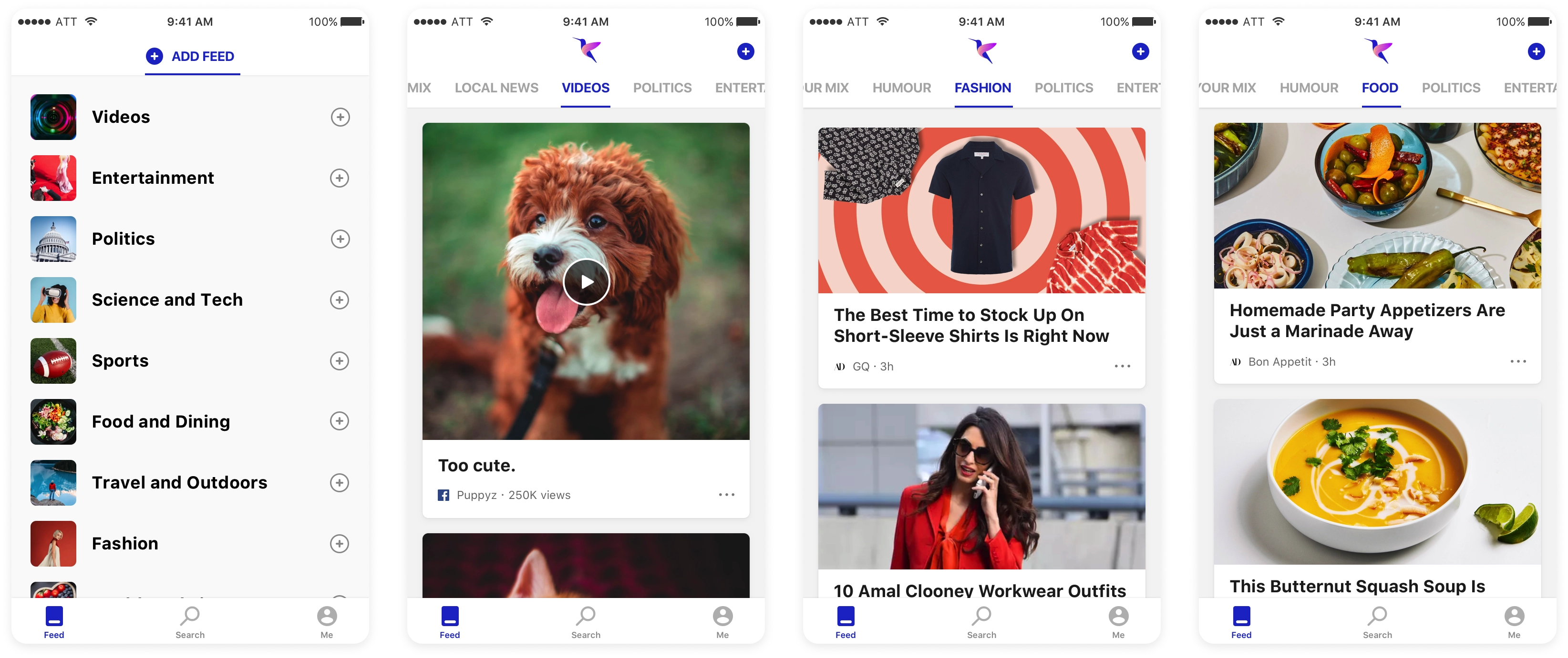
Explore and pin feeds that you like, search for trending videos, or check what's happening in your neighborhood—all in one place.
Feed Card types
A blazing fast and simple first run experience
First run experiences are crucial to the sucess of the app. We believed in providing instant value when users open the app for the 1st time. The experience was made non-sign in friendly, we didn’t want to create a roadblock/barrier to experience the app.
Secondly we explored two different approaches of when should we ask users to select interest and topics of their choice. Went ahead where we land the user straight into the feed with the top card asking users to personalize by selecting topics. The top card will remain after 2-3 launches and if the user doesn’t engage then it will convert into a small card in the middle of the feed.
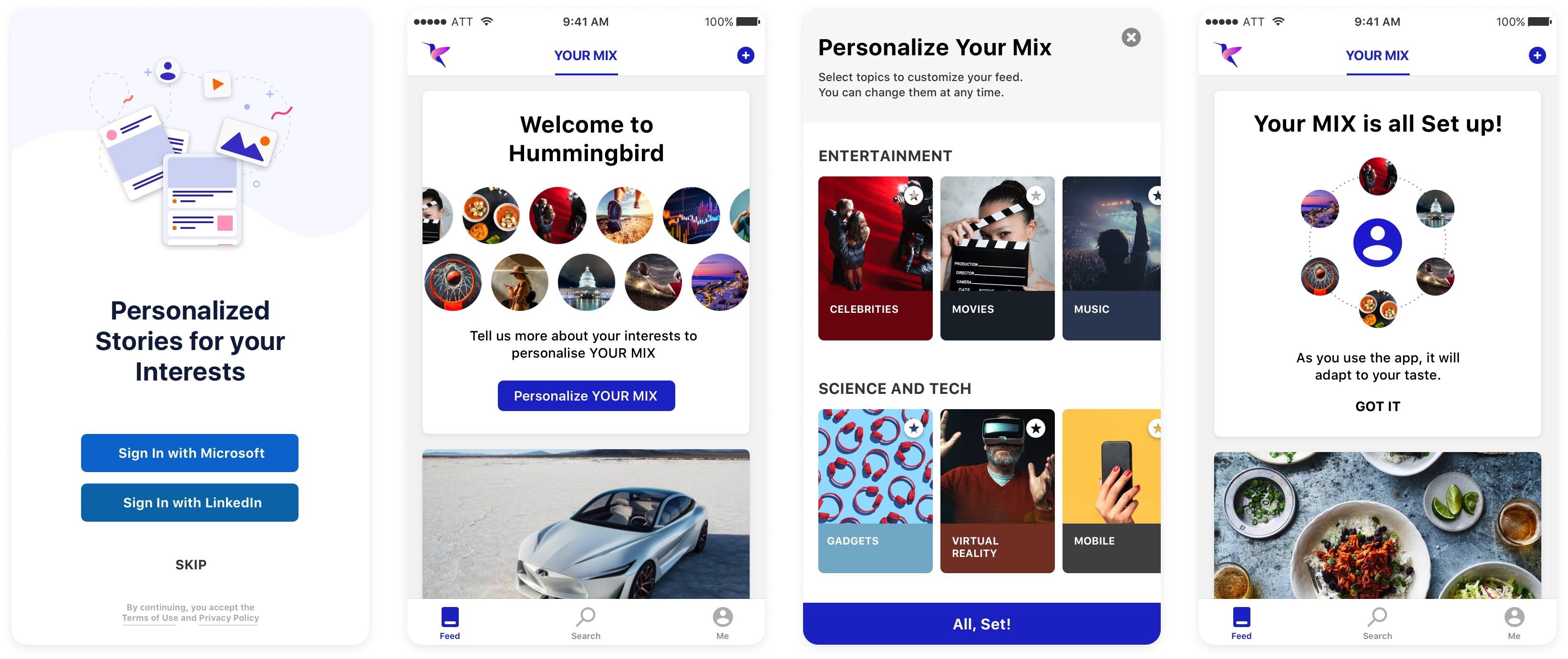
Also the articles of the first run are selected carefully so as to give a well rounded experience and inferences are taken from the engaged articles and reflected back on subsequent feed refresh.
Personalization was key to a relevant and engaging experience
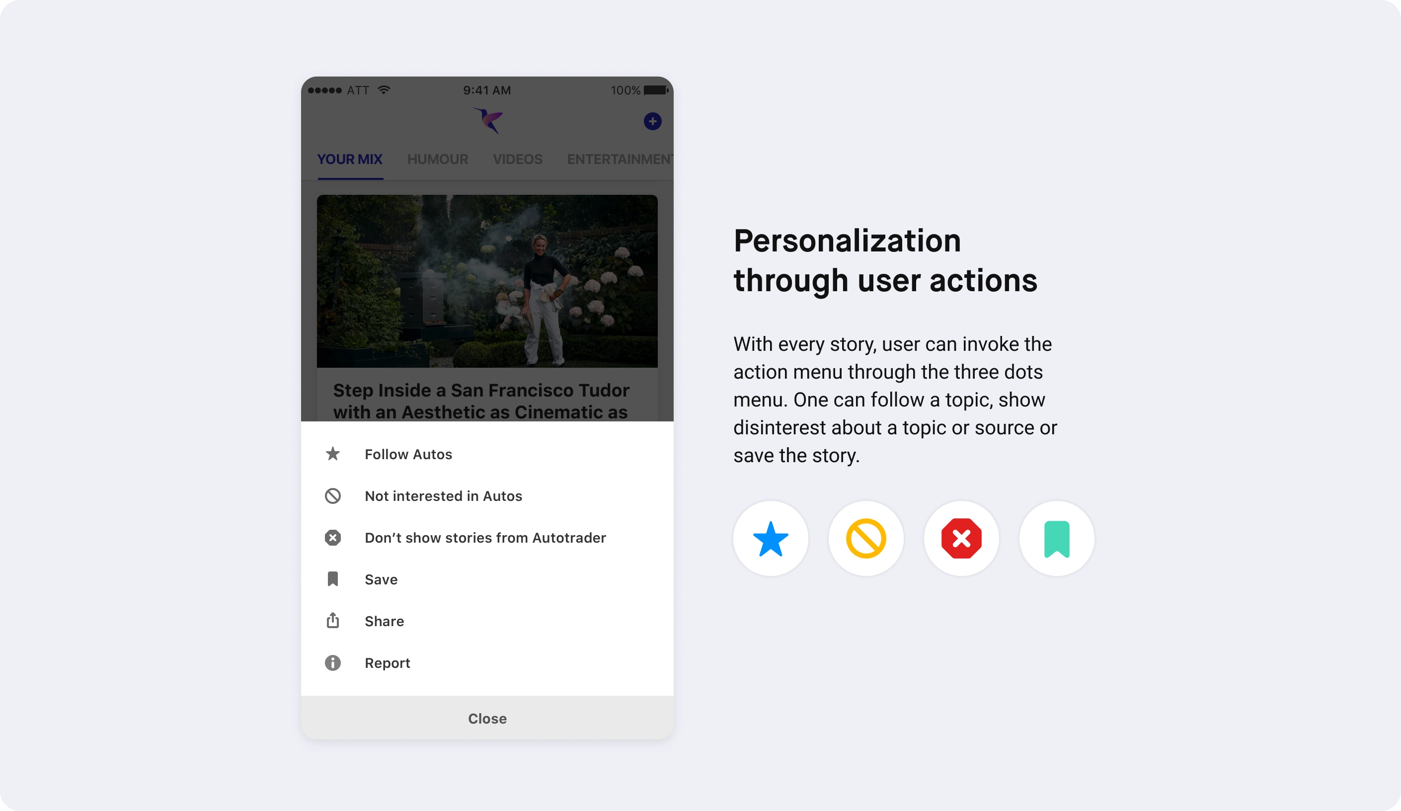
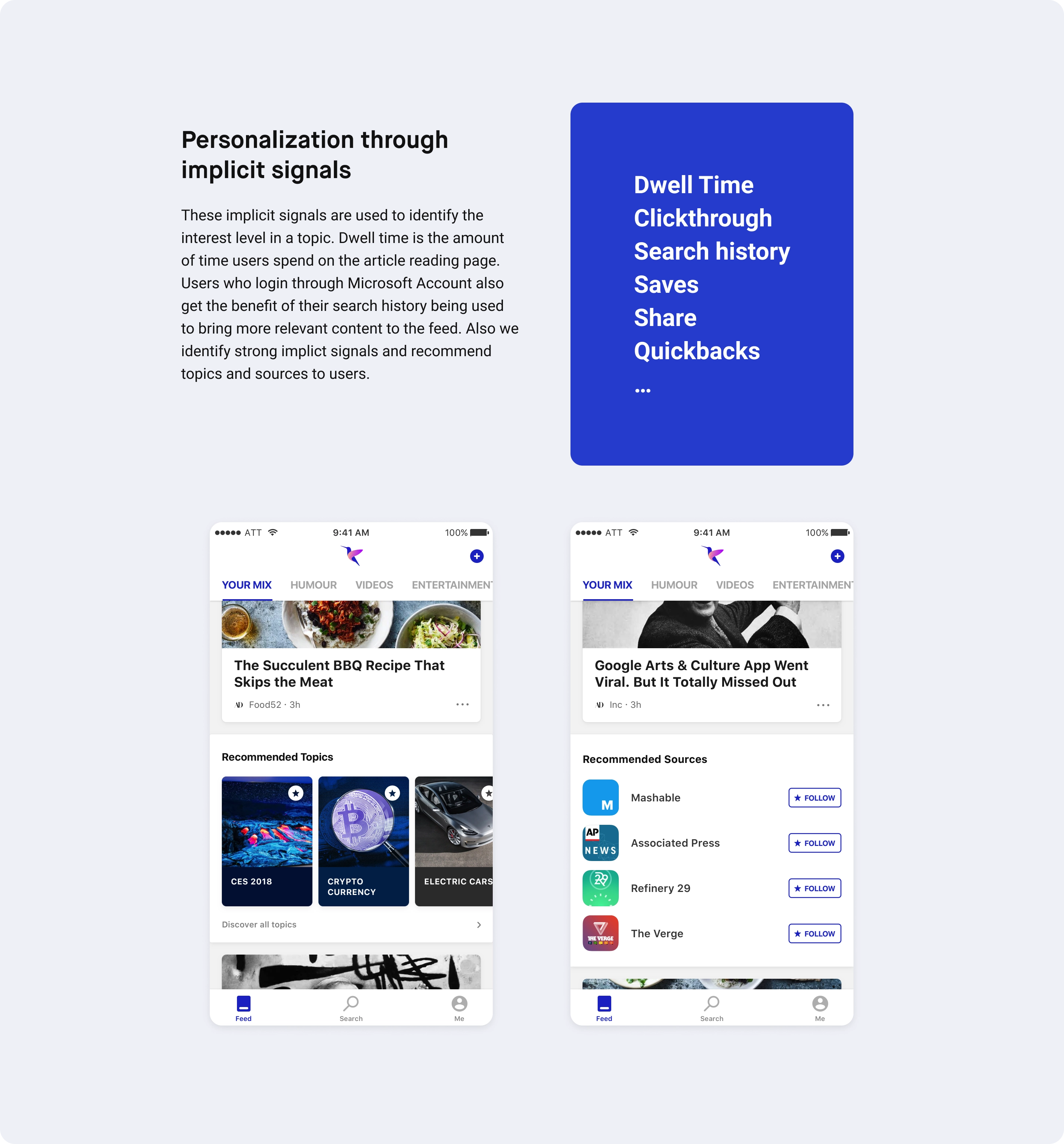
It was crucial to get personalization right to provide a relevant experience to our users. We came up with both explicit and implicit ways to do personalization. Explicit is based on user inputs, which are strong signals given by the user, where as implicit are which the system infers from the app usage.
Manage topics, feeds and notifications
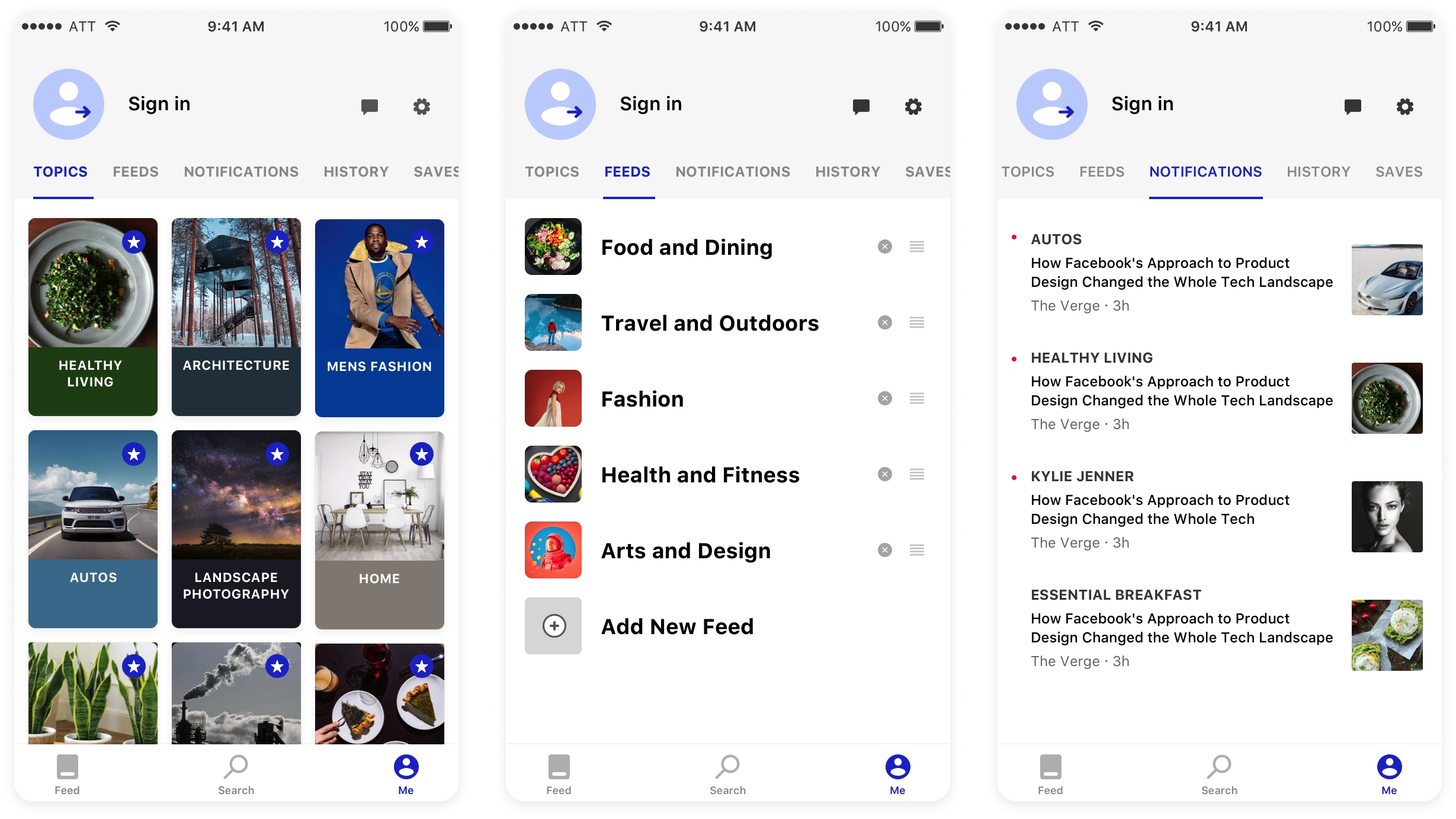
We wanted to put users in total control of what they follow and change that with minimal effort. We found out that user interest change over time which automatically would be reflected through organic use but the interest manager would provide an extra level of confidence to the algorithm. Also one could manage the feeds very easily.
Bringing all the Bing knowledge into the app
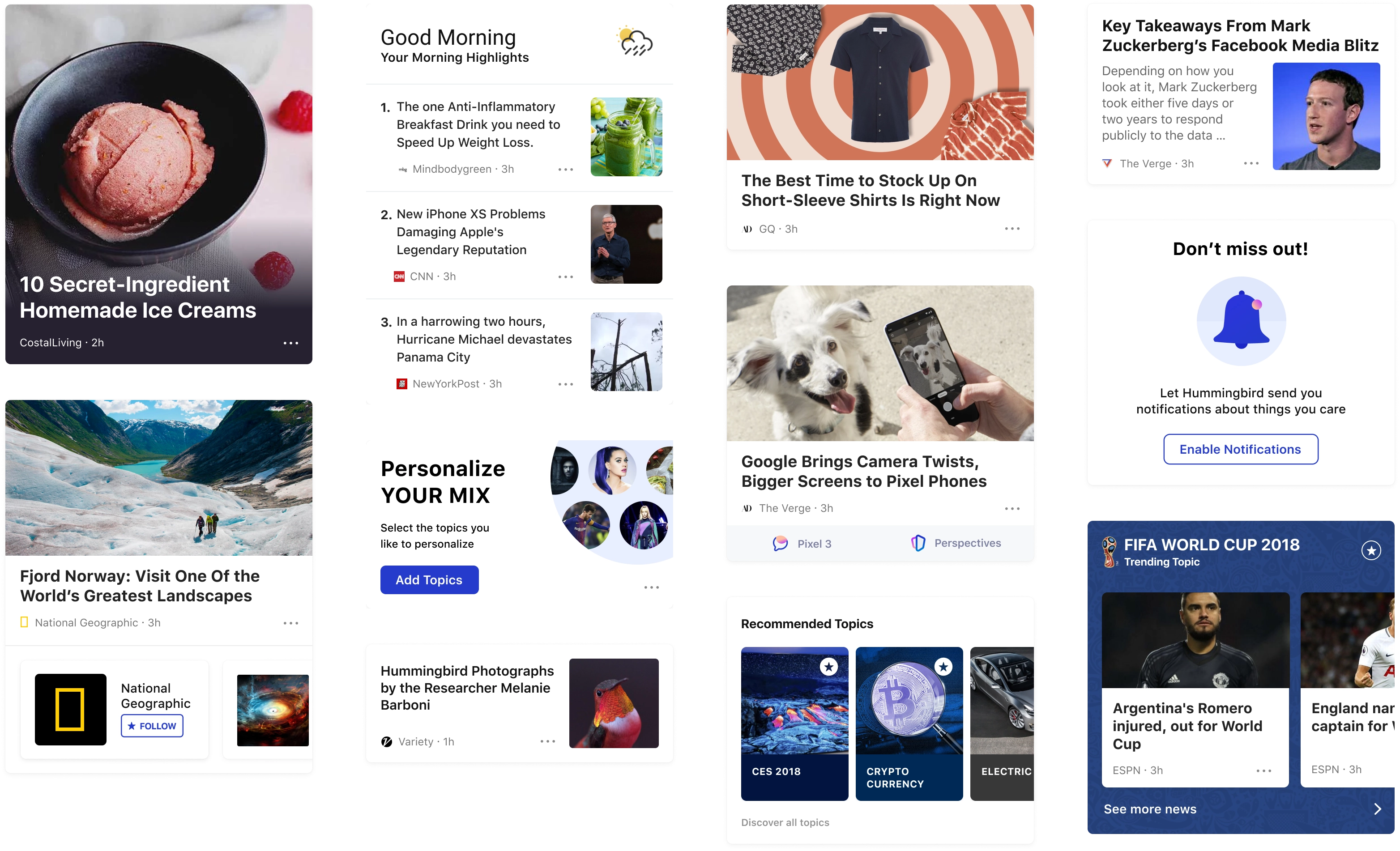
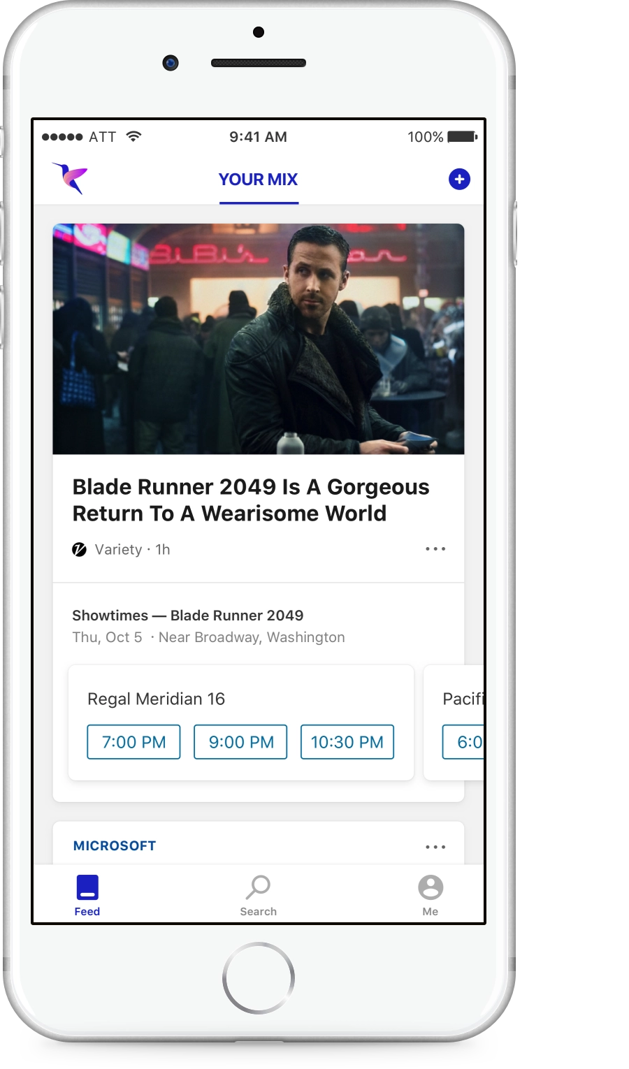
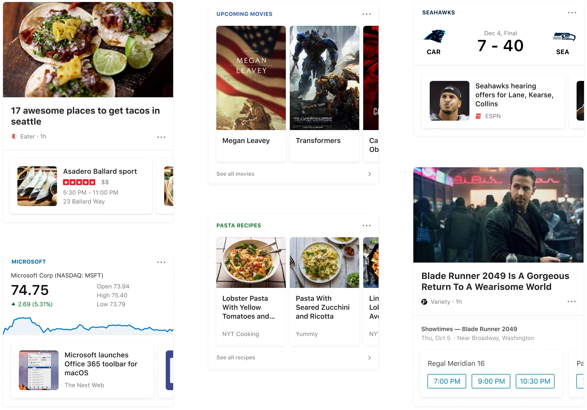
Coupling relevant structured content to the news story would provide a more meaningful experience to the user. Designed card experiences for the below verticals.
Sports
Weather
Finance
Movies
Showtimes
Entities
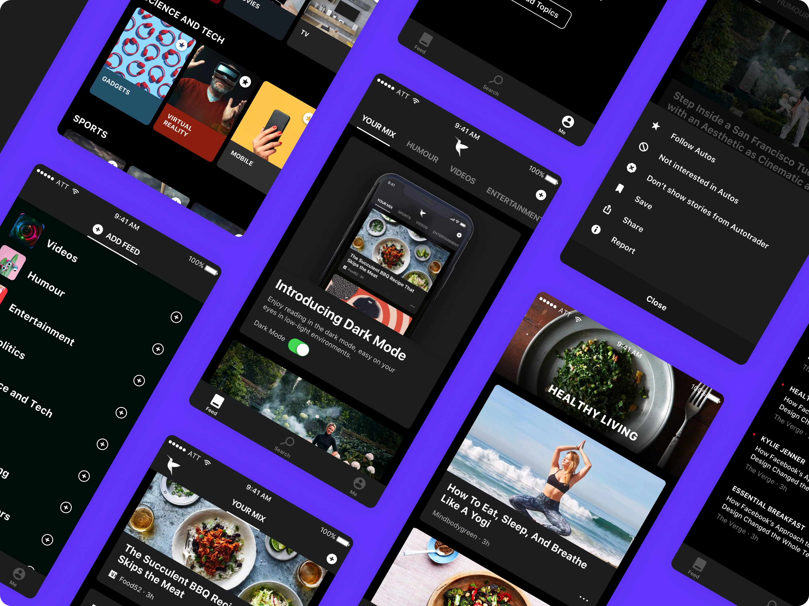
Dark Mode
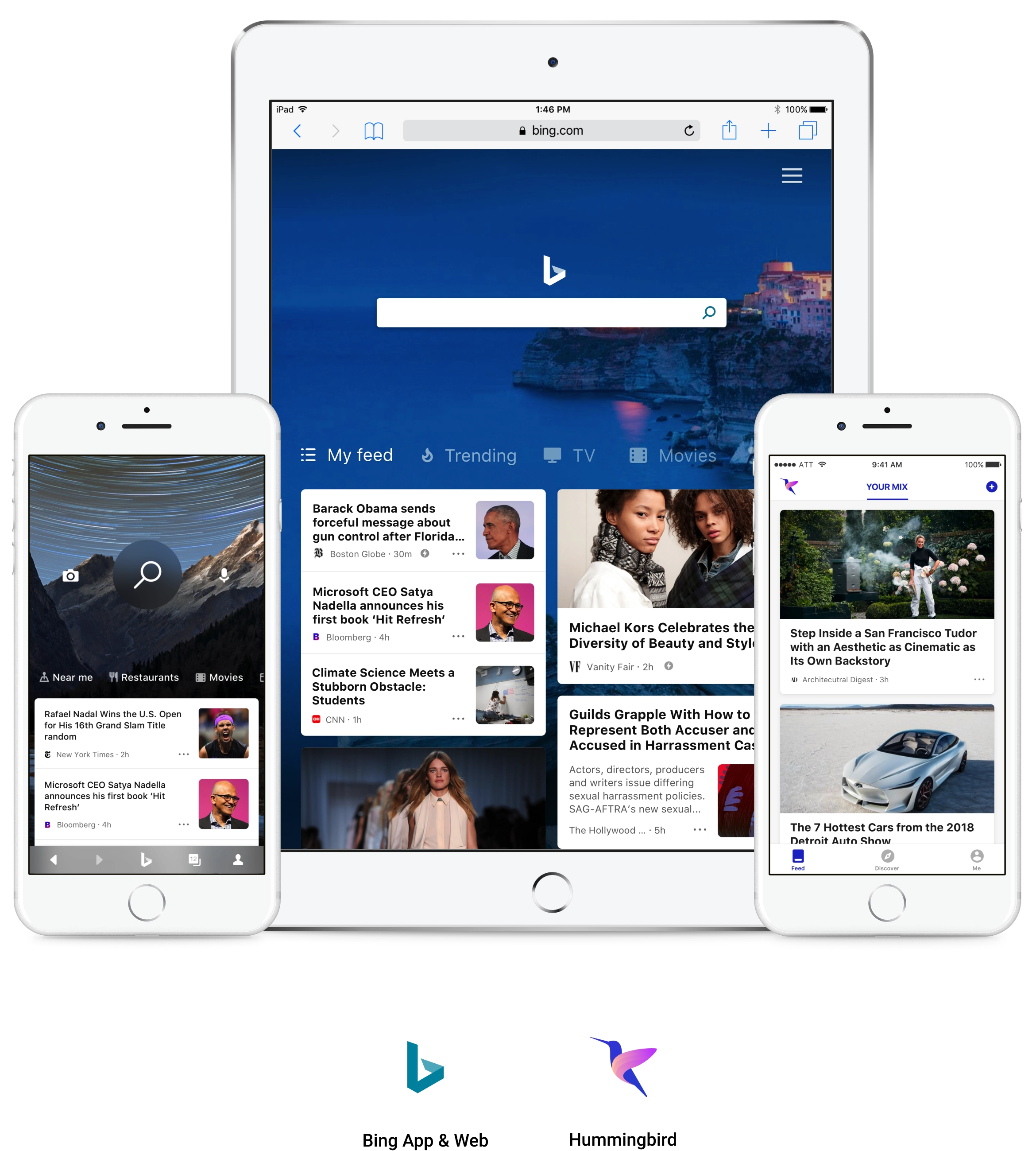
Growth strategy — Feed as a platform
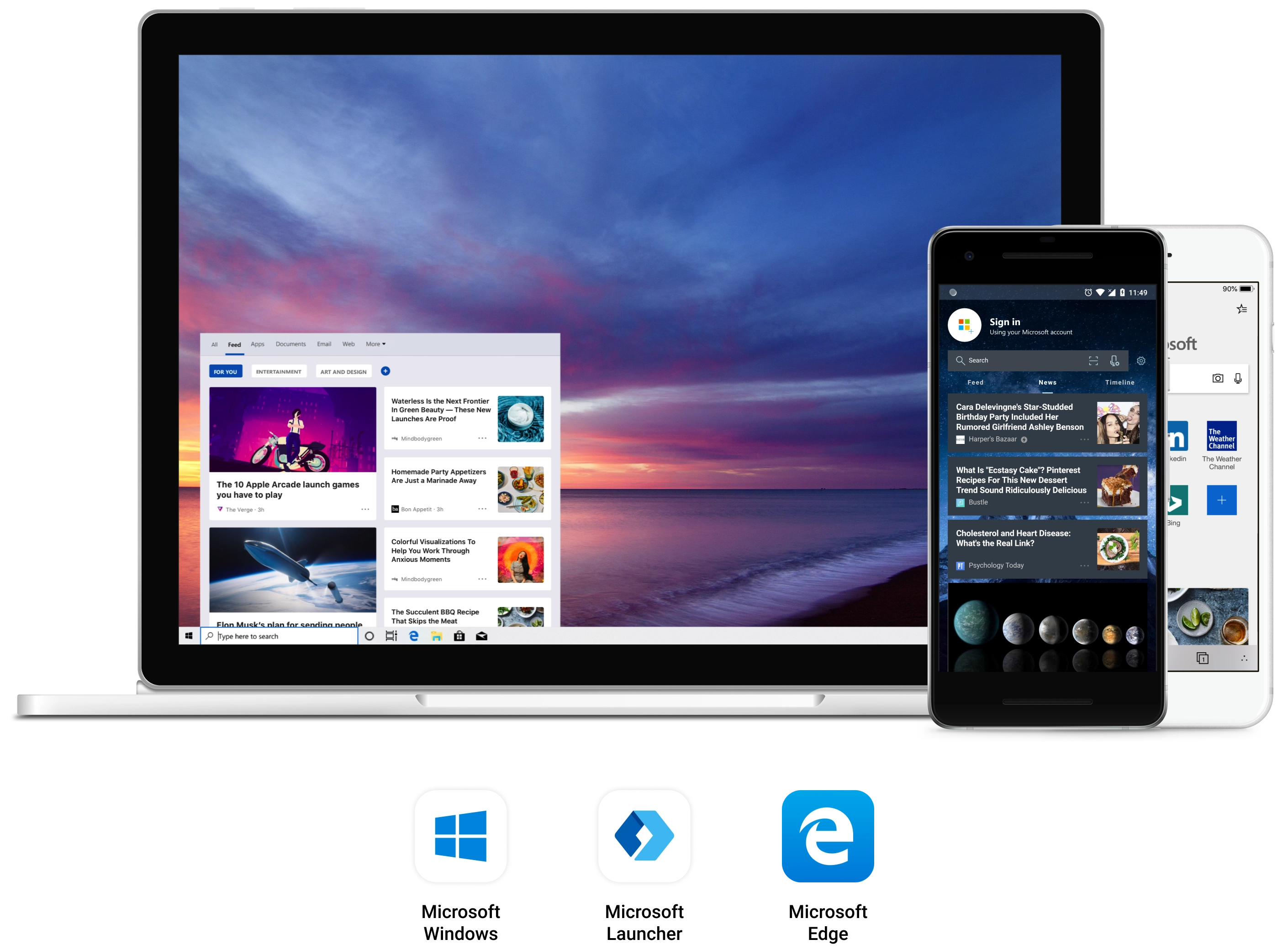
Hummingbird was the dedicated news feed app where we did quick experimentation, learned from them and integrated into other products like the core Bing App, Windows Start menu, Microsoft Launcher, Edge Mobile. Experiences were available across iOS, Android and different device types.
Integration with other Microsoft products
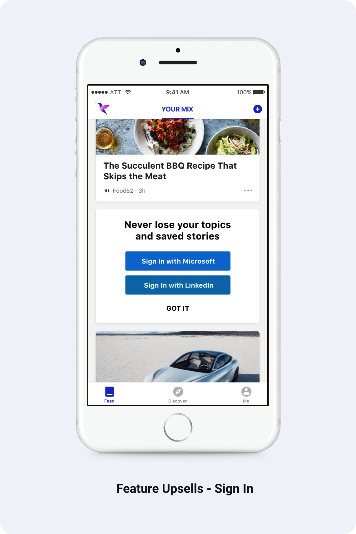
Driving retention & engagement with educational experiences
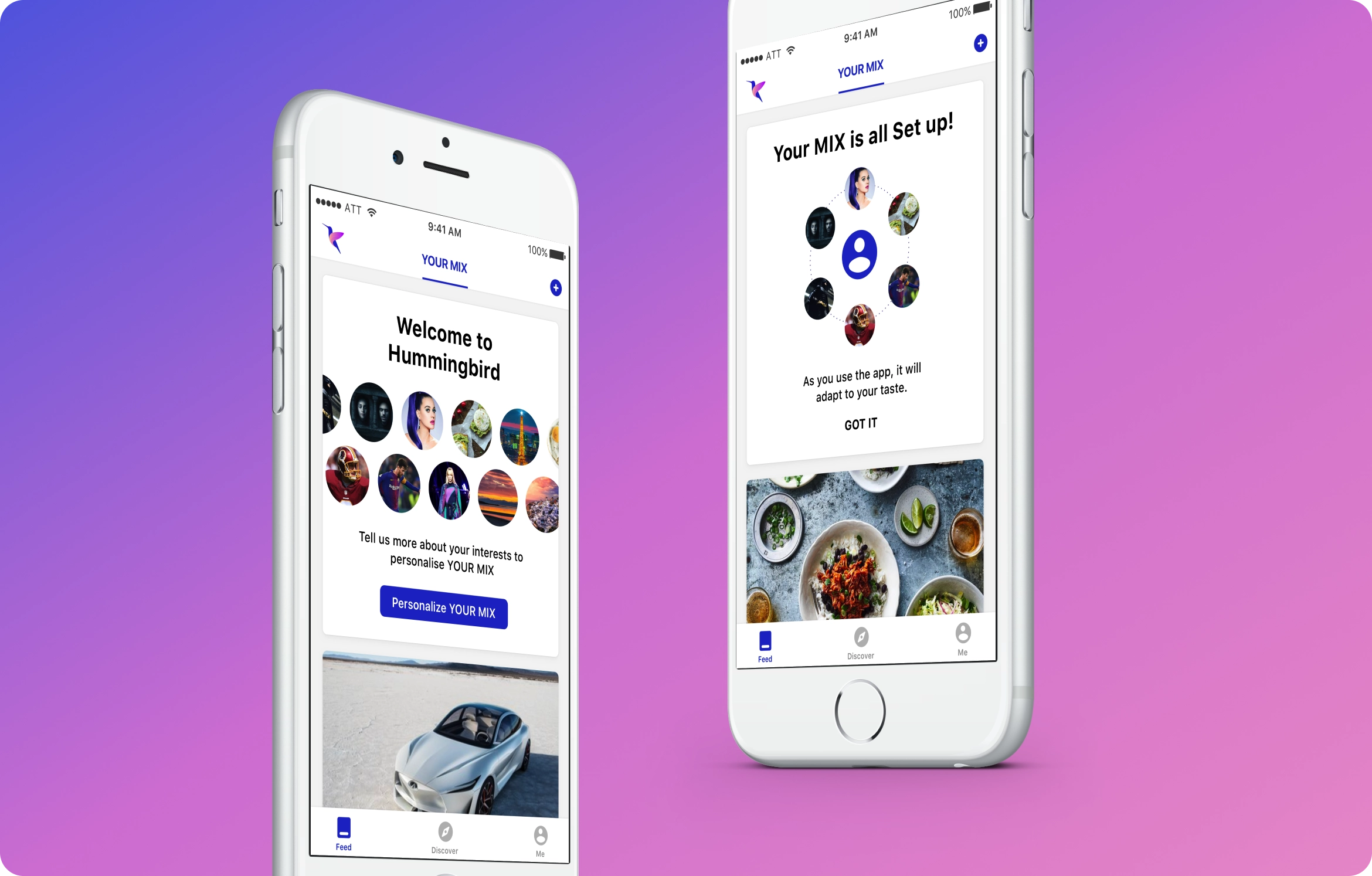
Welcome experiences as well as jumpstarting personalization, sign-in upsells, feature upsells and value, feature tours, tailored landing experiences, personalization nudge’s
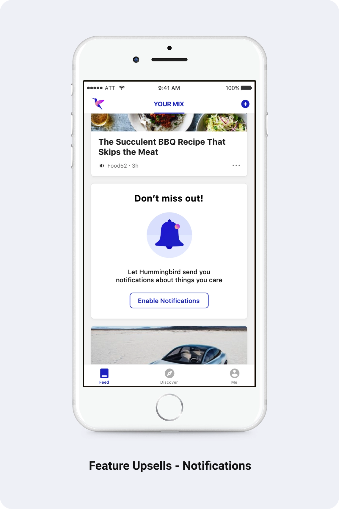
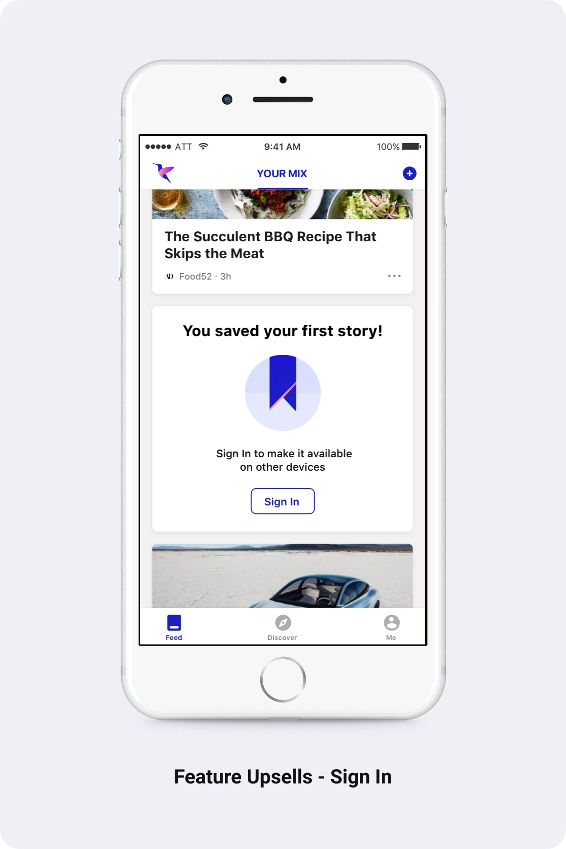
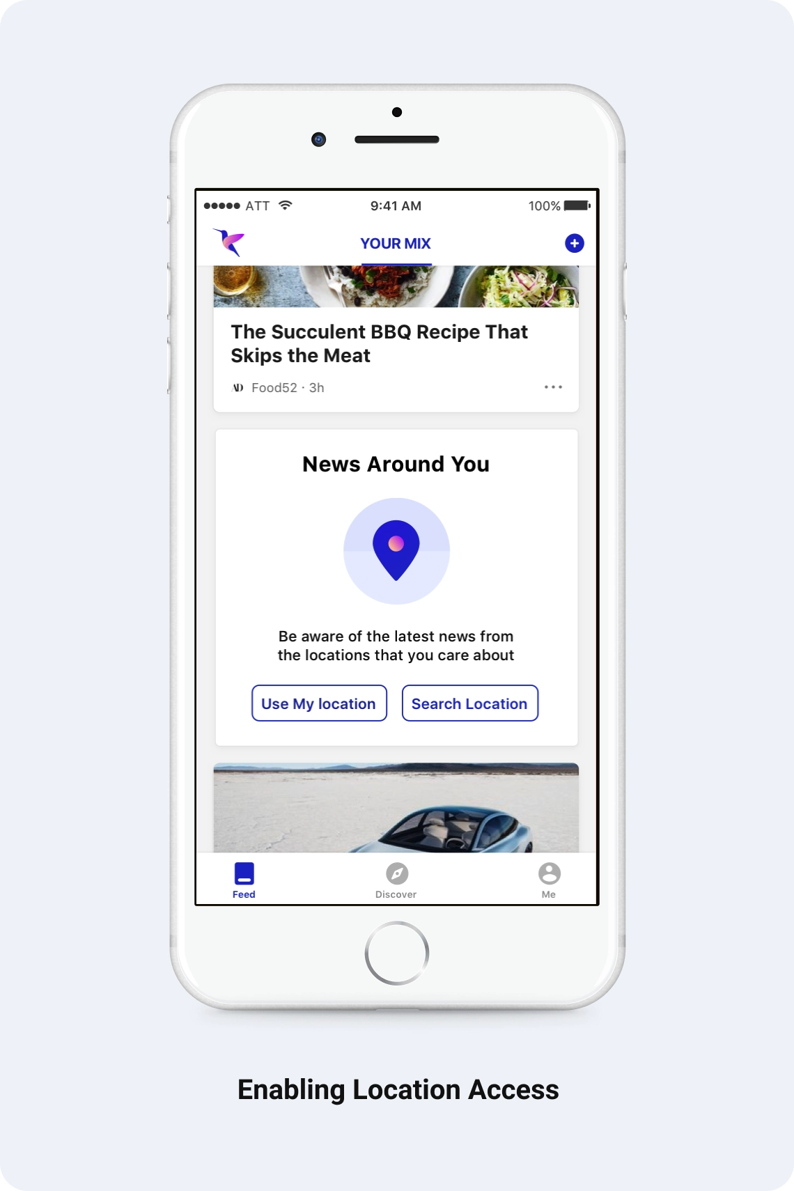
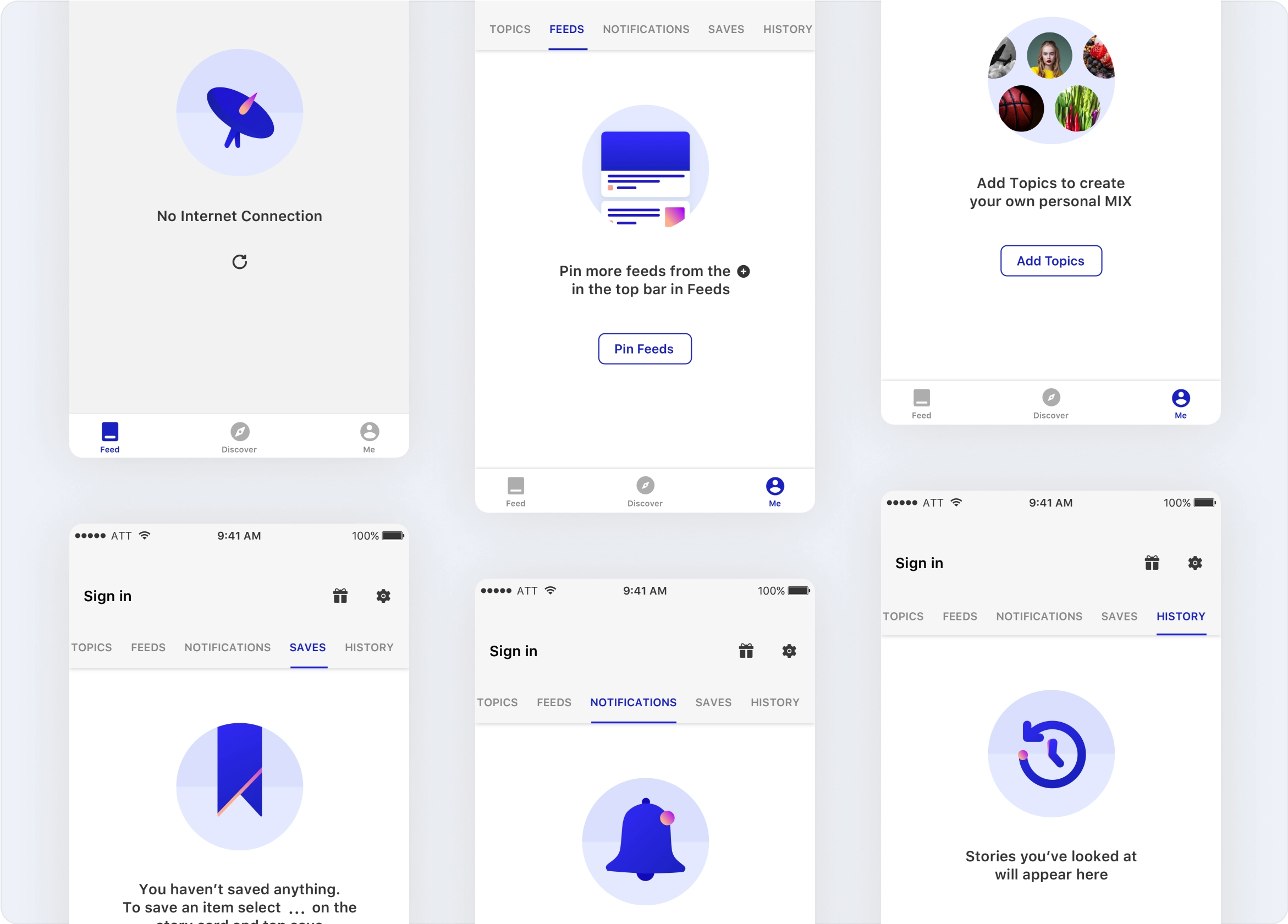
Empty States
Designing the brand
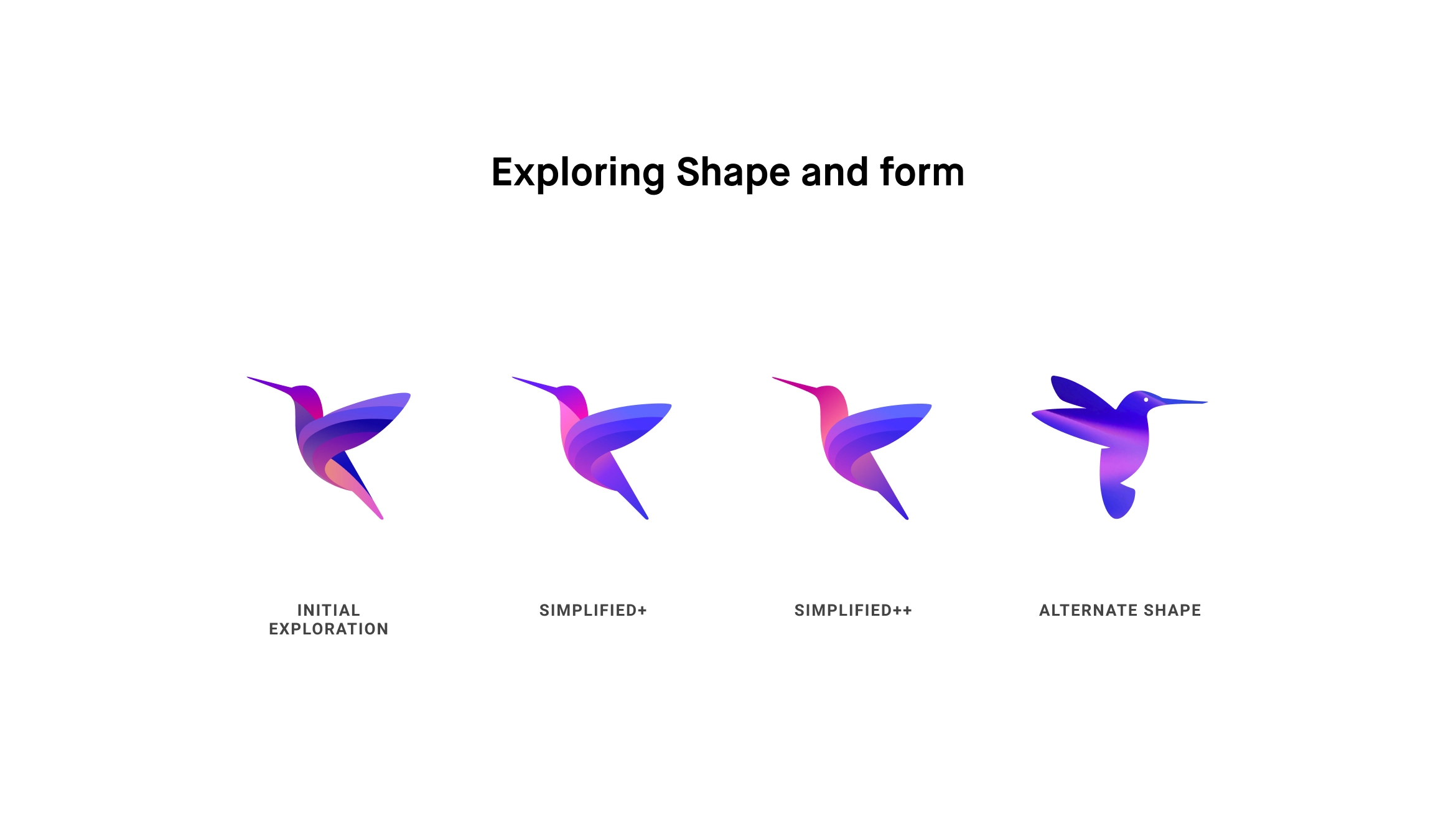
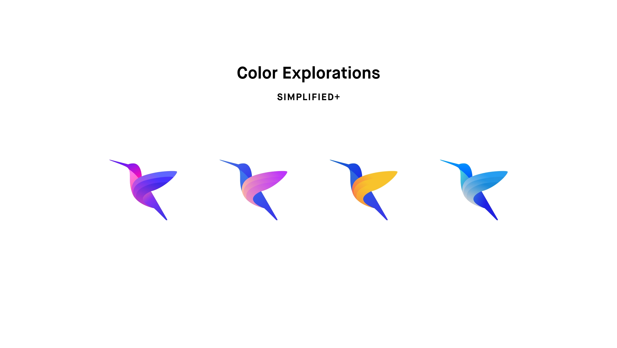
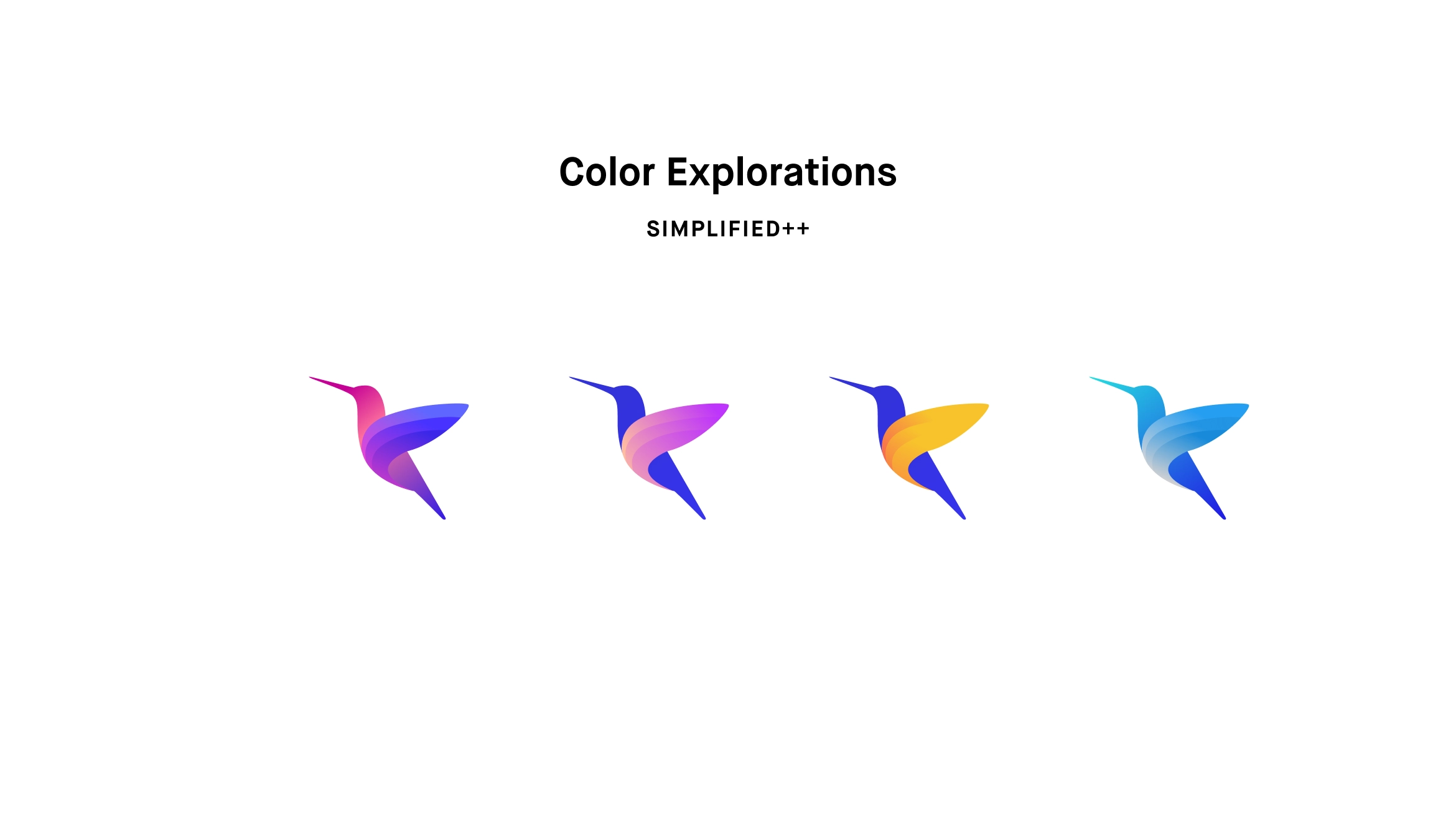
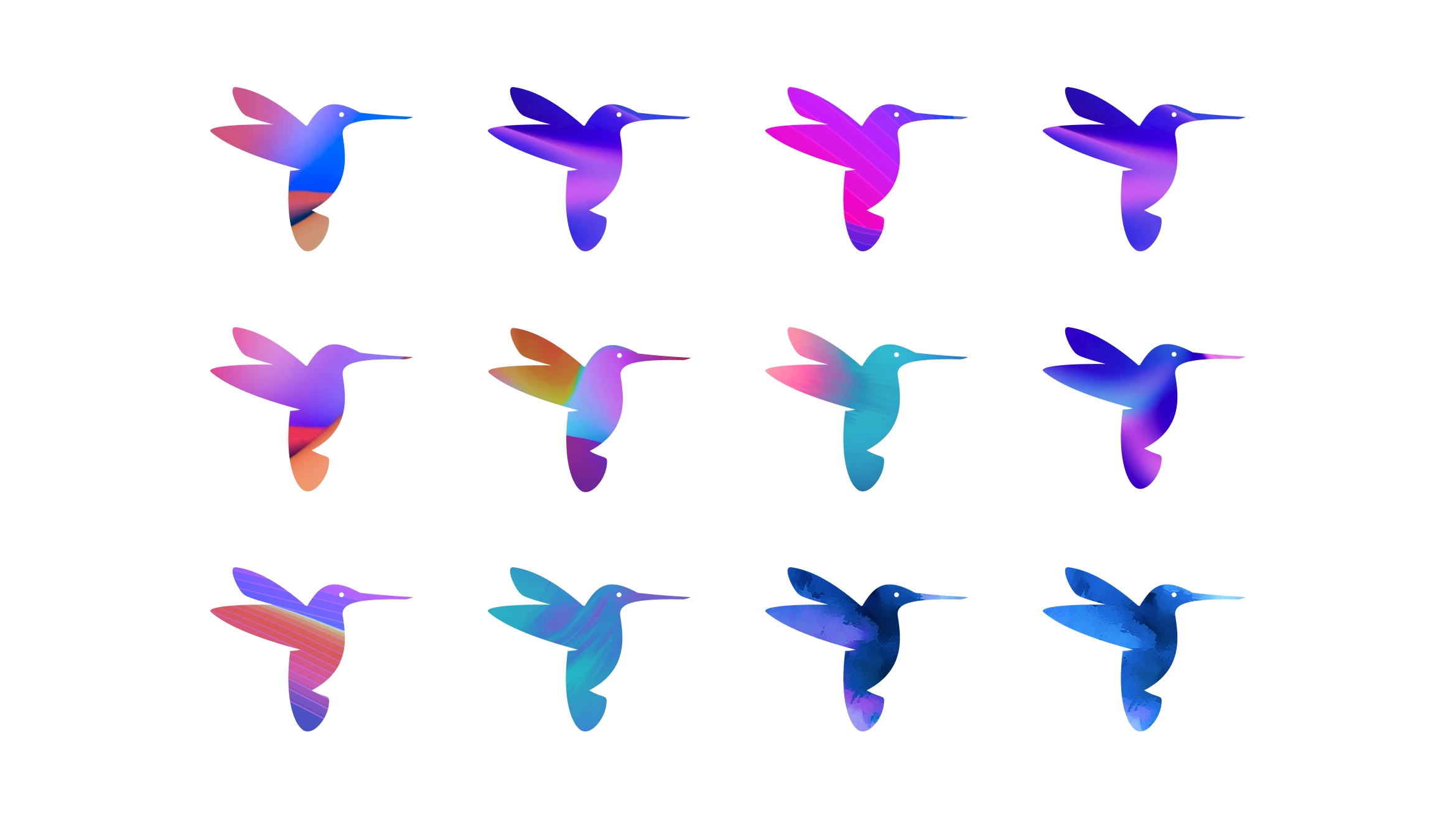
The team brainstormed on numerous names for the brand and the top choices came out to be “THE MIX” and “BINGE”. Unfortunately, both the names had medium risks of copyright infringement so we re-did the naming exercise and came out with Hummingbird, as it is a symbol of eternity, continuity and infinity which closely reflected on the feed principles.
Creation of the mark
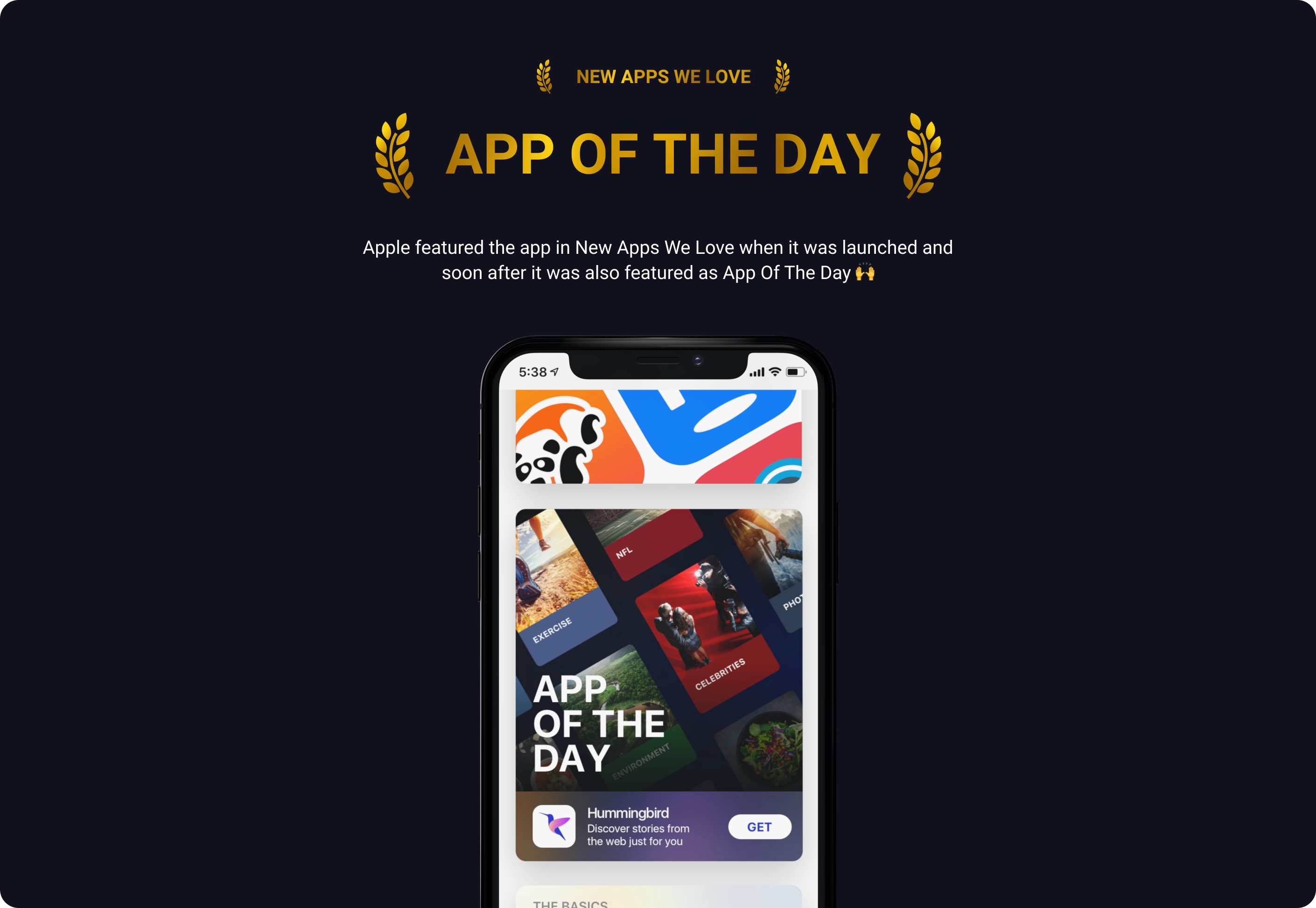
The Outcome
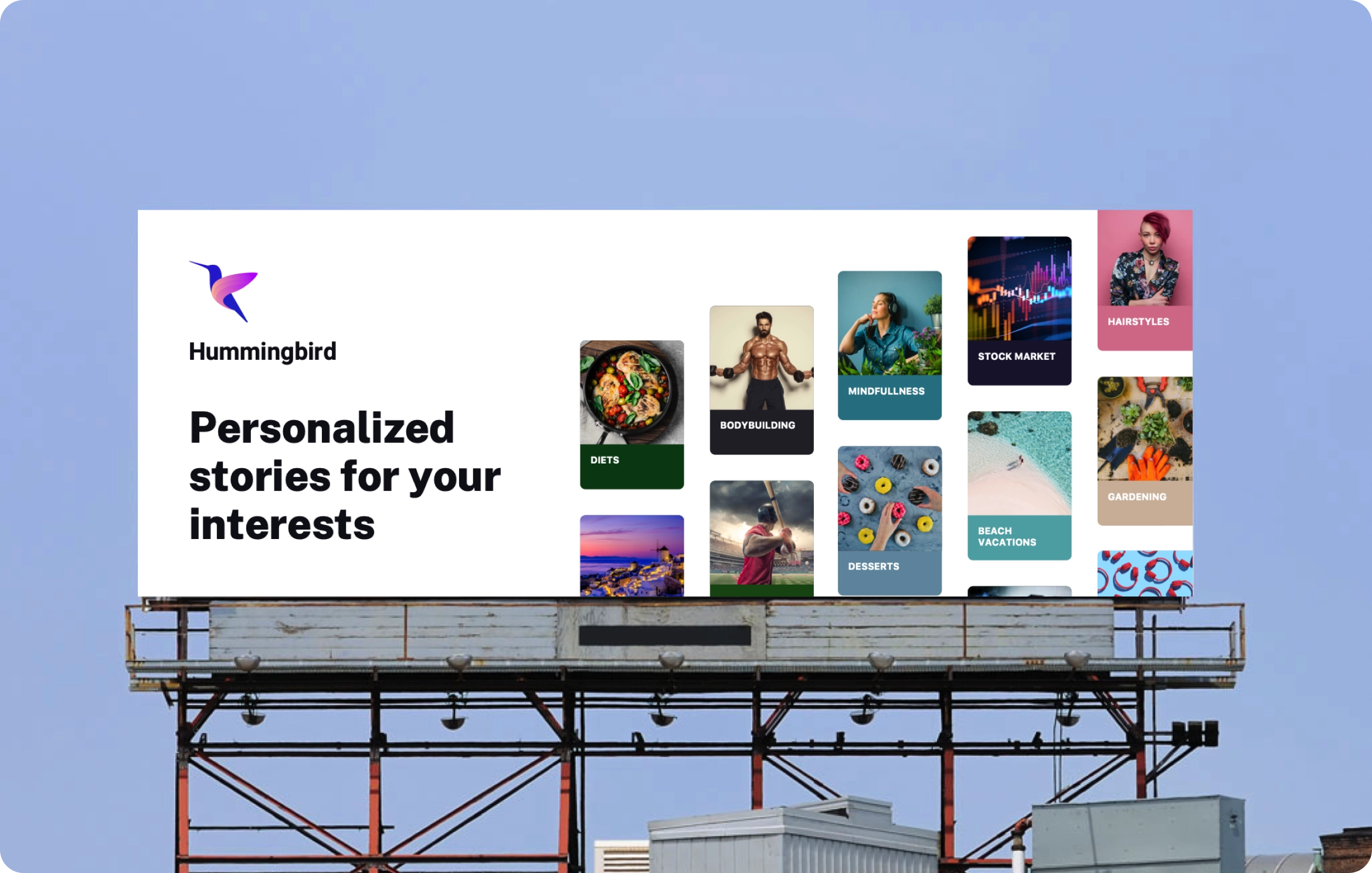
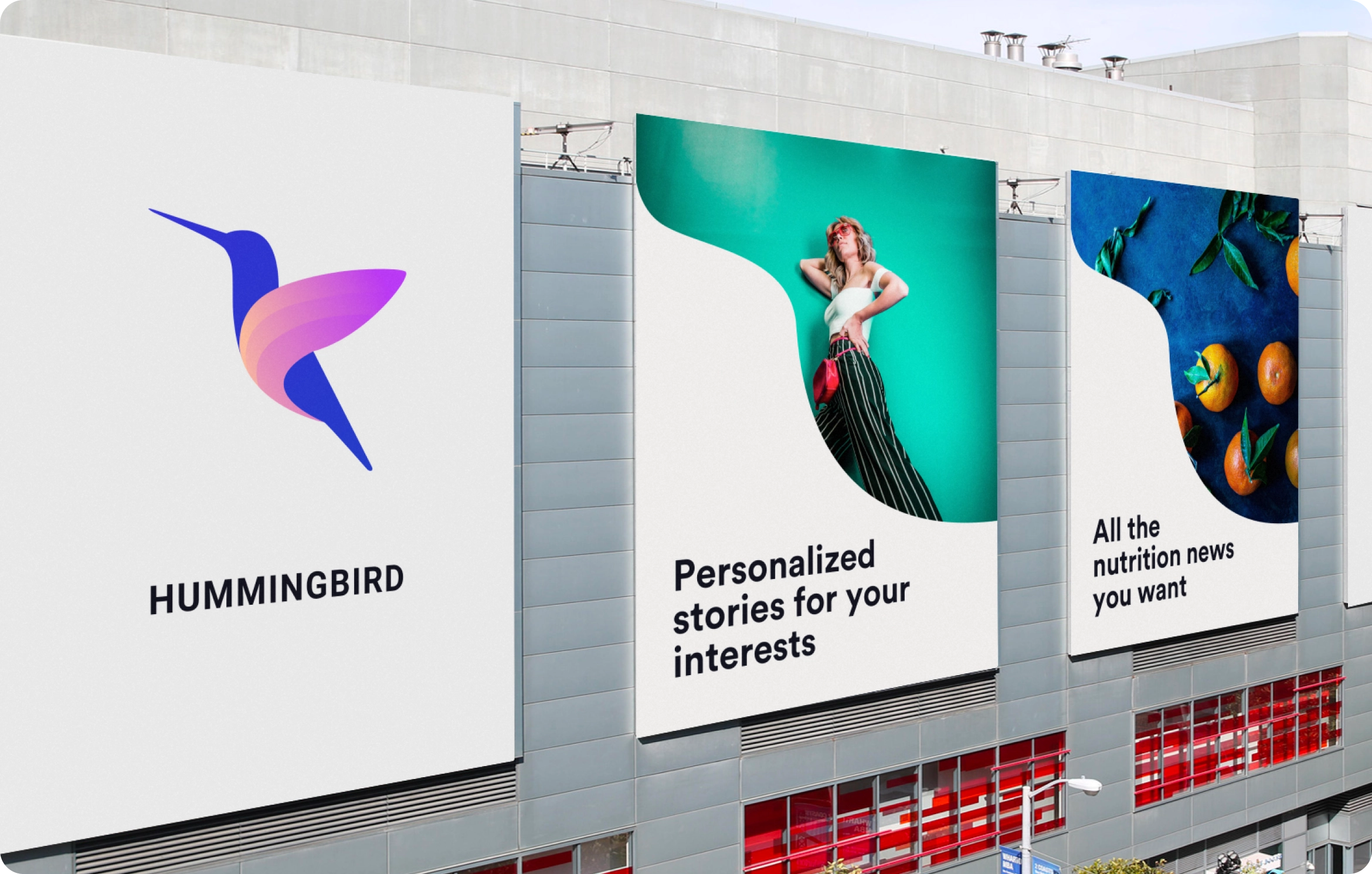
Brand Campaign
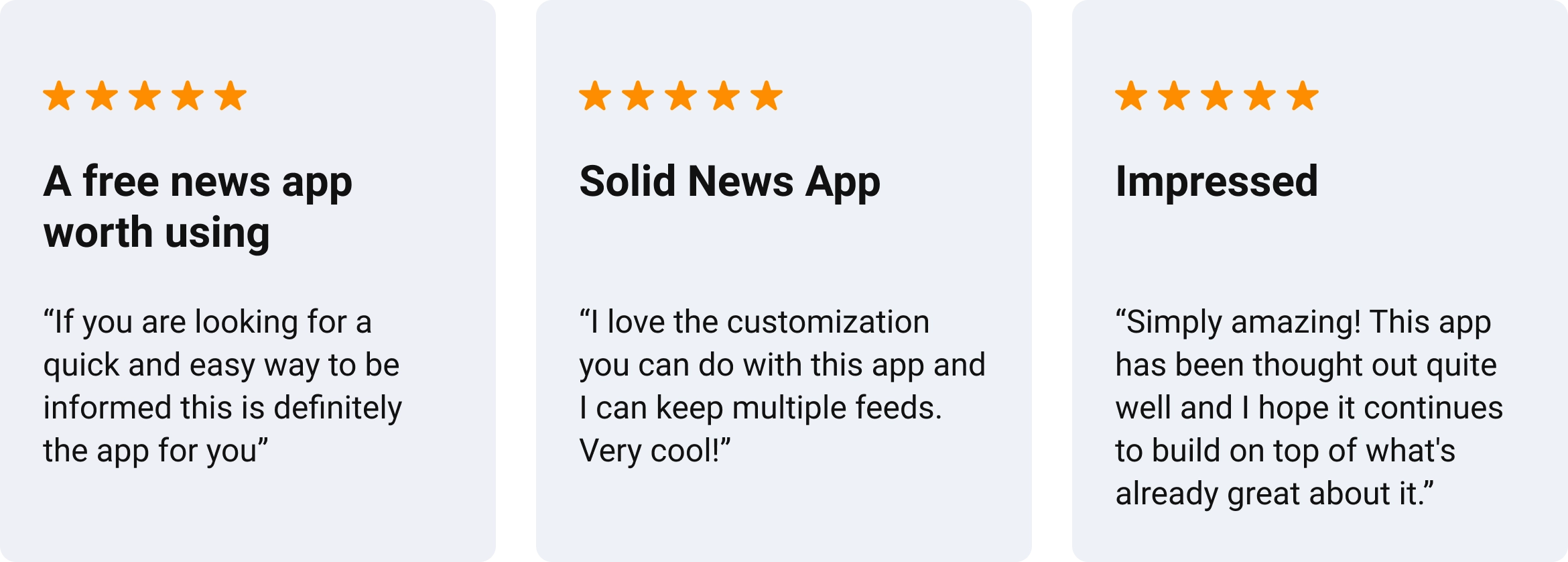
Appstore reviews
Impact & Learnings
